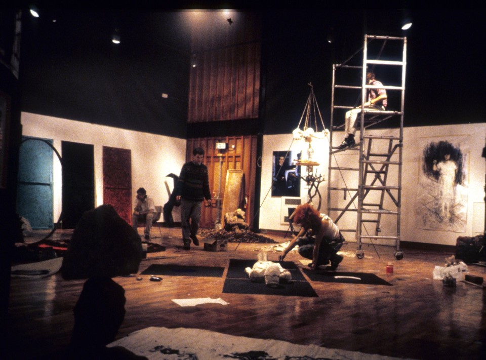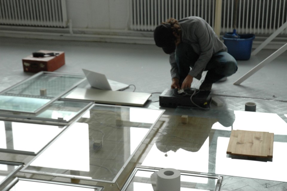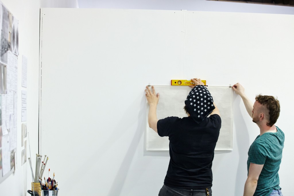
An annual presentation of student art work has been a fixture of art schools perhaps since their inception. Certainly from the 1840s the annual Conversazione were the high point of the Sheffield School of Art’s calendar.

In their modern form – and ours at least can be traced back the mid Twentieth century, when it was held in the Mappin Gallery – this was a chance for graduating students to display their final pieces – and they also often performed a role as examination. Whilst most assessment these days takes place outside the exhibition, the holding up of a period of learning and research to wider scrutiny is still at the heart of the Degree Show. Katrine Hjelde has noted that
“Material ‘knowledge production’ is a critical activity of the art and design subjects: the art school is always both at the cutting edge of this production, and continually engaged with its histories. The degree show exhibition is relatively unique in its belief and understanding of knowledge and learning demonstrated materially in public.”1
The degree show is, for most of the students taking part the real moment when their accumulated, produced, knowledge is demonstrated, a real opportunity to begin to affect change in the world. This may not be the snapping up of a world-beating innovation design for its immediate production, or the sale of a body of paintings to a major collector (although, of course, this does happen). Rather, through rendering the learned and understood as objects and interventions in the world it opens up space for new networks and possibilities, be these with potential employers, collaborators or commissioners. Although we can characterise this as a rite of passage, unlike an exam result or even a graduation ceremony, this is a forward-looking event. It’s both a finish line and a starting grid – it all starts from here.
In format the show is series of discipline-organised mini-presentations, or even a set of self-contained solo and group exhibitions set cheek-by-jowl, across a series of buildings. It comes together through the agencies of teaching and technical staff and the students themselves. It is ‘curated’ but in a way that offers multiple understandings of what this might be – and the languages of display are varied. What goes for displaying jewellery doesn’t necessarily work for showing off large items of furniture. It has a rhythm and pattern of its own – part based on the availability of resources, part almost a tradition-lost-in-time. Why does one subject always exhibit in a particular space? How do previous years’ exhibits impact on the way things happen right now? There is always a large abstract painting, just there, unchallenged.
Considering what the degree show might be, Carl Rowe finds
“Art students are by instinct communal and inclined to collaborate. As educators, we observe them in the first weeks of their study, finding their feet and coalescing in small like-minded groups, concocting their means of exposition at first within the comfort of their studio and increasingly through more ambitious means. It is the shared energy and unbridled creativity within these self-identified collectives that ignites new creative and curatorial forms. Folly then, if as educators we don’t detect and amplify this exciting newness, and travesty if at the end of their study, the degree show represents only the safest expression of their creativity”2
Yet, as Rowe hints, this romanticises that process – within which, the varying needs, demands and ambitions of our nascent artists and designers are also subsumed within an institutional juggernaut. Decision-making is compressed, colliding with immutable deadlines. Once the doors open to the public, there can be no further changes. Set against a finite and inflexible space, students compete for better locations, or are elsewhere allocated and limited to identical spaces. Formats that have worked in previous years are preferred because they are known to work. Technicians’ schedules and the demands on students time elsewhere can limit opportunities for experimentation that more established creatives would take for granted.

In pulling together a digital exhibition, with no single physical counterpart, all of this is up for grabs. We are in new territory here. This moment, this Degree Show, this site of knowledge production is located in a radically different space to all its predecessors. In the flattened space of the web, the unevenness and compromises of installing artworks are very different. The location of power sources, lighting, load bearing walls and accessible routes is replaced with the need for small filesizes and Alt-Text captions. Technical staff change, from those with years of skill in mounting exhibitions and responding to the shifting demands of over-stressed finalists to those skilled in coding, databases and responding to the fixed demands of software updates and server loads. In place of a nuanced, collective, contingent and unfinished process comes a controlled workflow and dissipated, distributed producers.
When thinking my way into this degree show, I was very conscious of the omniscience that was being handed to me – a chance to see the entirety of the show, from an early stage and to explore what connections could be made between students and their works; to see what alternative ways into this material could be found; to be challenged to create interest and depth in all this flatness. With so many works potentially submitted, it was clear that this was about structuring a process, rather than an exercise in connoisseurship and that enabling serendipity was more important than boxing works into place.
From the start, it was clear that there should be one key principle – that the work itself should be front and centre. This led to other decisions – first to postpone the show until November – to give us time to build a web platform to host it, but also to give students time to work, time to finish projects – a luxury when space perhaps was at a premium. (When circumstances in the spring conspired to swap offline for online in all walks of life, students’ final projects were part-finished, garments unmade, models unbuilt, studios swapped for bedrooms and kitchen tables.)

The submission process itself became an element of the structure – a certain number of images were specified, texts were asked for in a certain structure, yet submissions varied considerably. At the same time, I hope this process facilitated dialogue – enabling contributors to update and change submissions up to the last minute (and potentially in the future) as well as adapt their submissions to our evolving technical requirements – and allow us to adapt our technology to better support their submissions.
An important decision was to focussing each student’s presentation on one key ‘signature’ project, whilst giving opportunity to supplement this with a body of material. This focus on the single, stand-out piece is an attempt to texture the show – making for connections and for contrasts; as work is surfaced, depending on the method of browsing the site, physically made objects butt up against renderings of the imagined. Similarities are emphasised whilst differences stand out too.
Prioritising the work dictated the design of the website – typographically-led, with minimal branding and lots of white space where it could be created – mimicking on one hand white cube galleries, but also the design-led, professional environment of our intended audience. It structured the site’s navigation, providing different ways into the material – by discipline, by theme (a hierarchy constructed from key words submitted by the exhibitors themselves) and by search. I like to think that these somehow echo the experience of physically visiting a museum or gallery: meandering through the galleries, heading to a specific exhibition, or looking on the paper map for the room with the one artwork that distance has been travelled to see. The use of scrolling, and the gossamer-thin layering of menus and subtle animation all riff on these themes.
And this interface is important. Silvia Põldaru has suggested
“the biggest limitation of any online exhibition [is] the lack of tactility. If one was to stand in front of a glass cabinet with a delicate spotlight highlighting the photograph, its existence would most certainly be more tangible. Its imperfections of scratches and dust spots, greases of folds, its texture and materiality would make the viewing experience more intimate and personal.”3
In this very specific space – both degree show and pandemic response – perhaps we can begin to reconsider what this tactility might mean. In considering the authenticity and aura of digitised exhibition objects, Nicole Meehan has noted
“It is the presence of the interface that makes interacting with the object both possible and somehow impossible.”4
If we consider this – as she does – as a site of production for our degree show, perhaps it is the only site which could accurately reflect the materiality of these objects.
I speculate that this allows a new agency for these works. With many projects here not realised in the way they would have been in previous years, their presentation gathers new meanings – renderings of unmade objects become speculations, glimpses into a better future or provocations, agitations for one. Here we find challenges to food production, to our unsustainable economy or proposals to embed education in consumer electronics. We constantly find narrative and storytelling– the muses of fashion collections are thrust into the limelight and photographs and video document stories of objects in use rather than ‘in showcase’. Jewellery and fine metalwork is worn or filled with food. Workshops – with human participants – accrue visibility as artworks or as design objects. Here perhaps are glimpses of how perhaps we might go about amplifying exciting newness and move beyond safe expressions of creativity.
Even before circumstances in the spring forced our reinvention of the degree show, our staff had been grappling with its format, exploring how it might better be reconciled with the needs of other stakeholders – could it be more useful as a marketing tool? Could we figure out better ways of bringing in a professional audience to network with our graduating students? Could we make it more visitor friendly and navigable? Could we increase its reach beyond the two weeks in June it traditionally took place and make it available beyond Sheffield? Whilst this digital exhibition does not provide all the answers, I hope, like any degree show, it provides a starting grid.
Tim Machin is Gallery Manager at Sheffield Hallam University
1 Hjelde, K (2020) Showing-knowing: the exhibition, the student, and the higher education art institution, Journal of Visual Art Practice, 19:1, 69-85, DOI: 10.1080/14702029.2020.1732613
2 Rowe, C (2020) The degree show may not be your best show, Journal of Visual Art Practice, 19:1, 53-68, DOI: 10.1080/14702029.2020.1724664
3 Põldaru, S (2017) Materiality and meaning in the context of online exhibitions. A case study of ‘MEMORY. Soviet Monuments at the park of Maarjamäe Palace’, Academia. Accessed 06/11/2020, https://www.academia.edu/33905160/Materiality_and_meaning_in_the_context_of_online_exhibitions_A_case_study_of_MEMORY_Soviet_Monuments_at_the_park_of_Maarjam%C3%A4e_Palace_Prepared_for_professional_heritage_colleagues
4 Meehan, N. (2020). Digital Museum Objects and Memory: Postdigital Materiality, Aura and Value. Curator, DOI: 10.1111/cura.12361