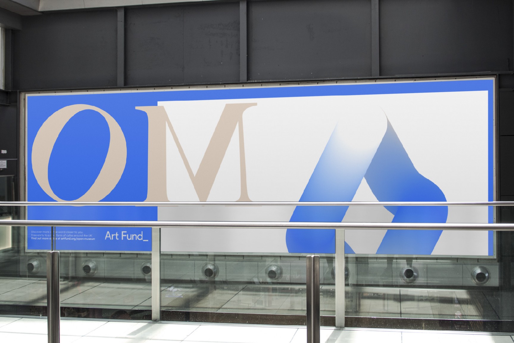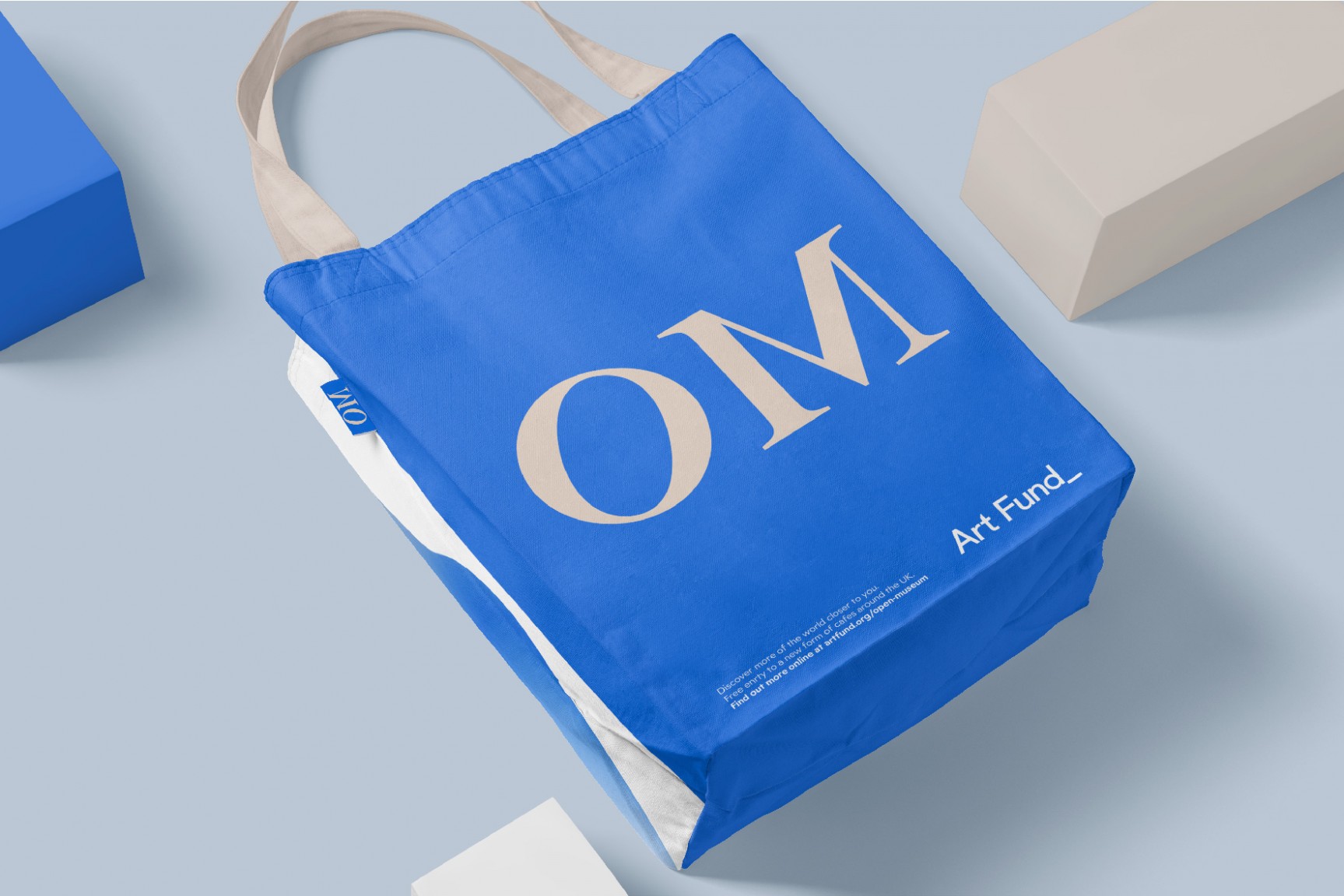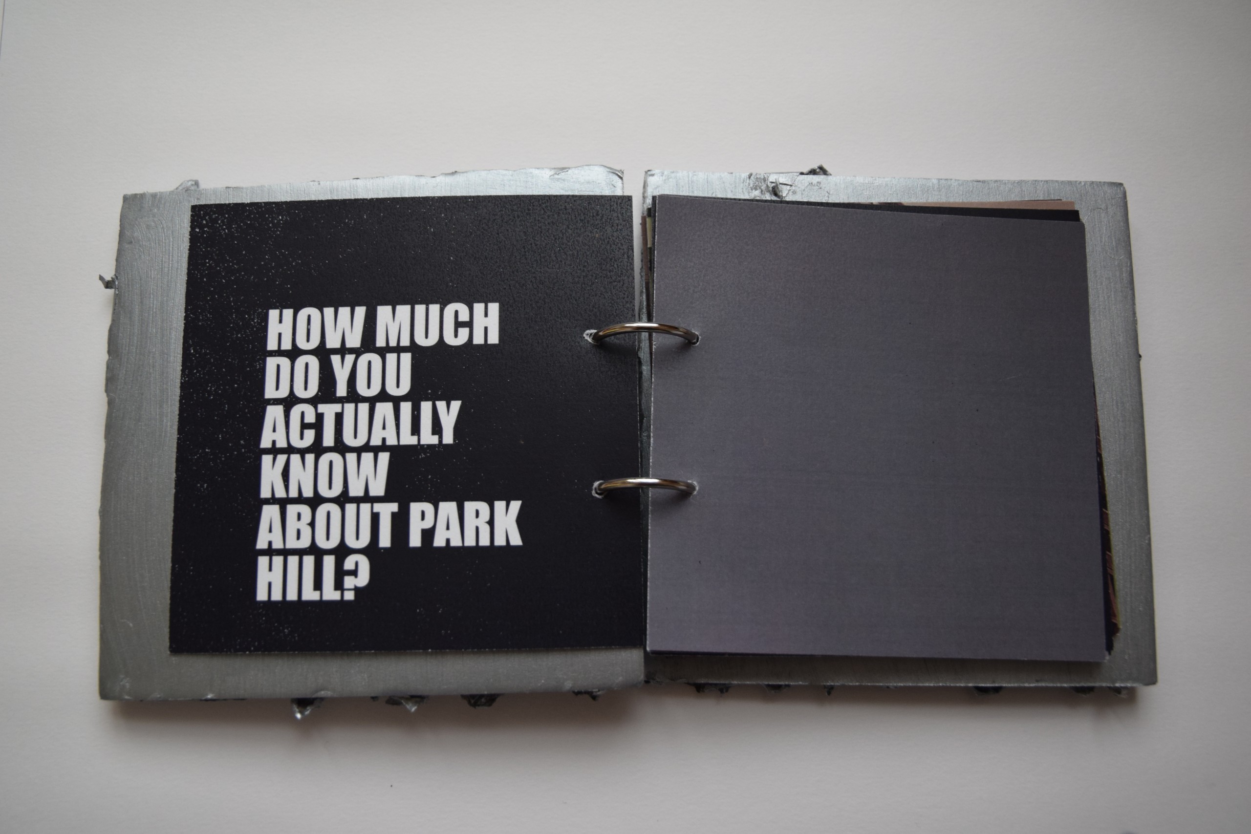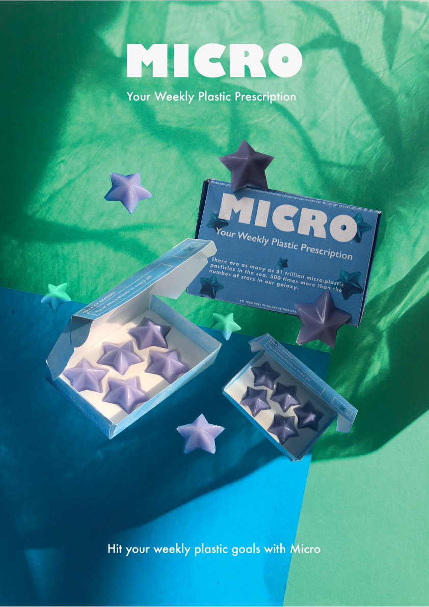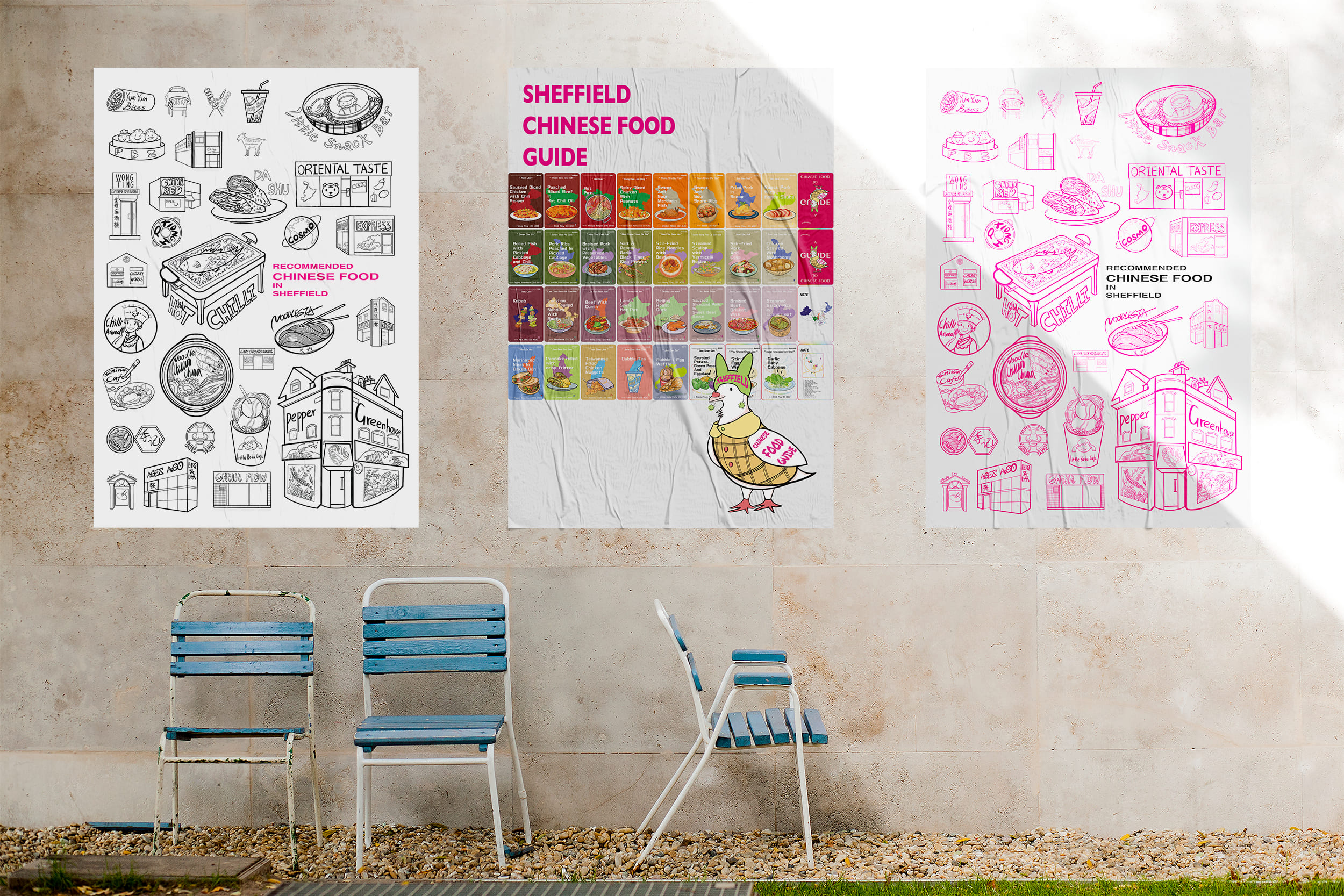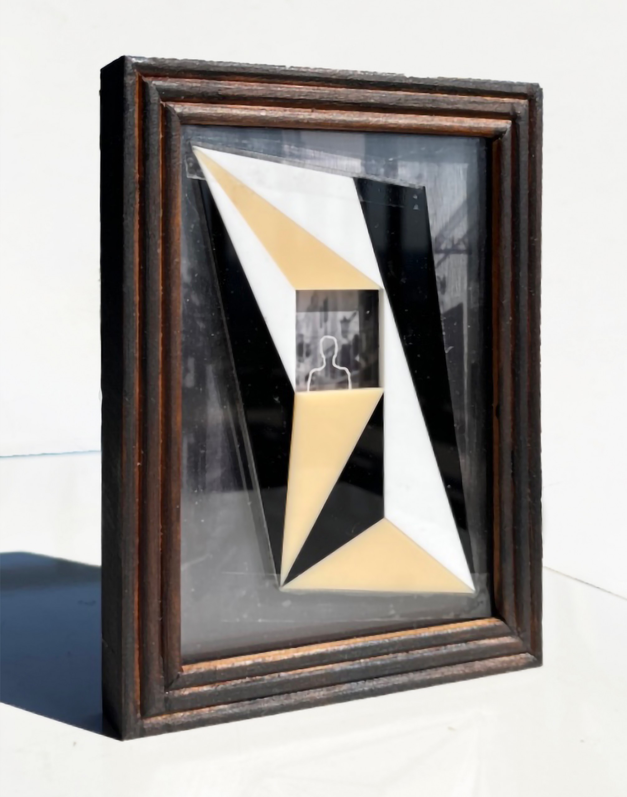

Open Museum brings community to art spaces, introducing new audiences to museums by creating a bridge through designed environments, supported by a visual identity that gives an escape through local café spaces.
Jamie Abbott’s identity for this project complemented the Art Fund’s branding, exploring typography to build a cohesive campaign. The brand is supported by soft colours to bridge the layout, symbolising the connectivity desired through the designed spaces.
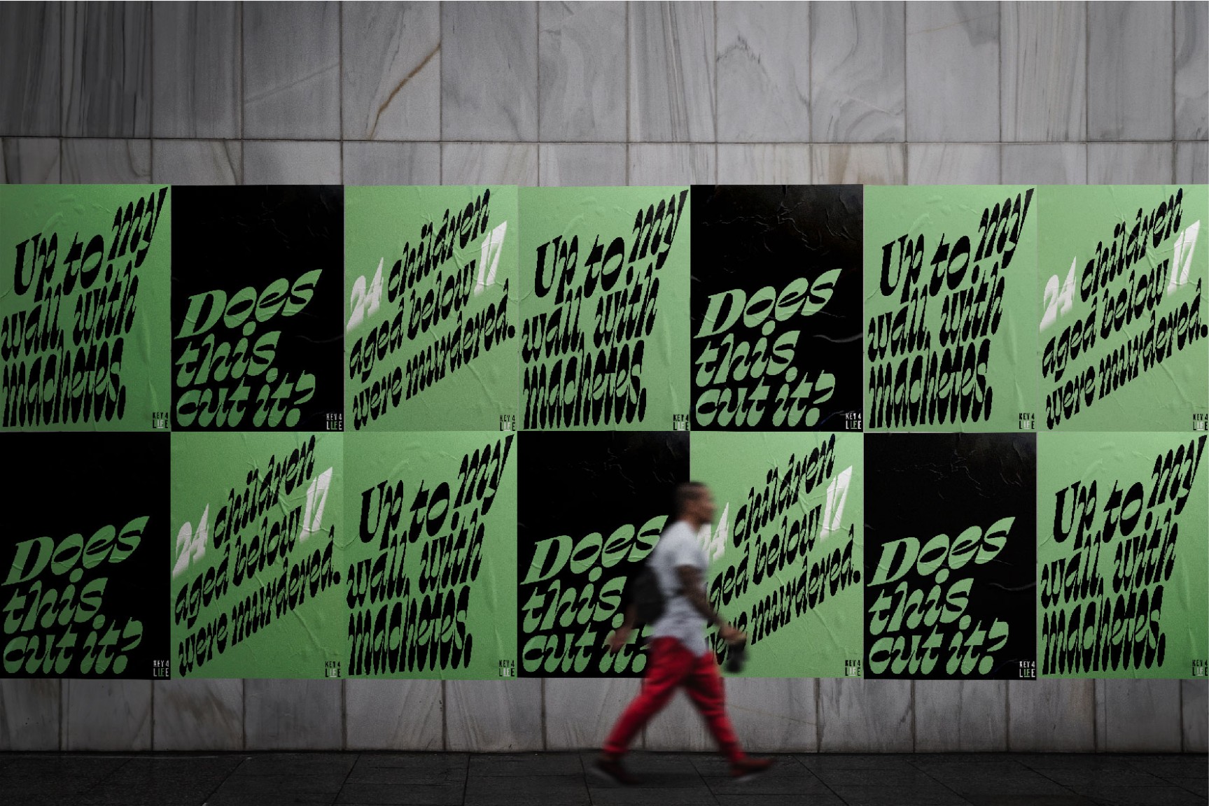
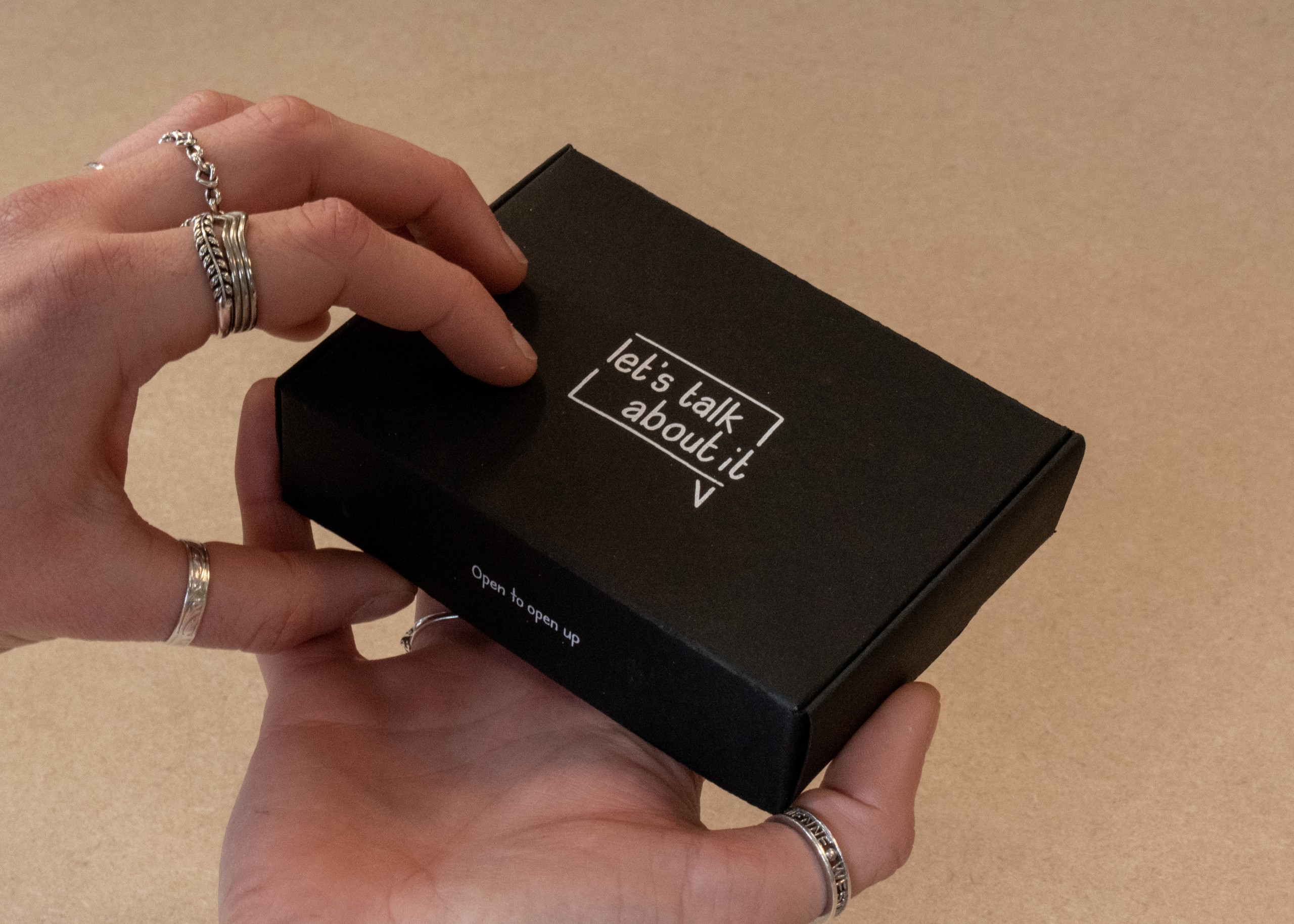
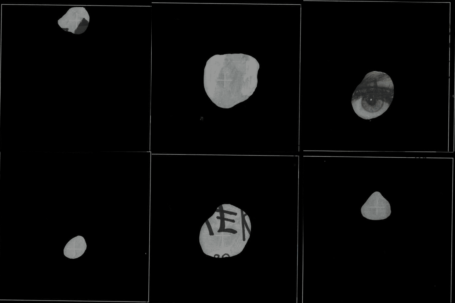
Abbot’s project Does This Cut It? revisits the subject of knife crime within the UK.
Abbott developed a visual identity that would stand out from its environment and achieve a more informal campaign that the audience could digest, contrasting the unpleasant data around the subject. He says:
“Words cut deep. They can destroy, and they can inspire. With typography, it allows words to matter more, add relevance, and turn them into actions and this can be further expanded on with motion.”
