Project
Ben
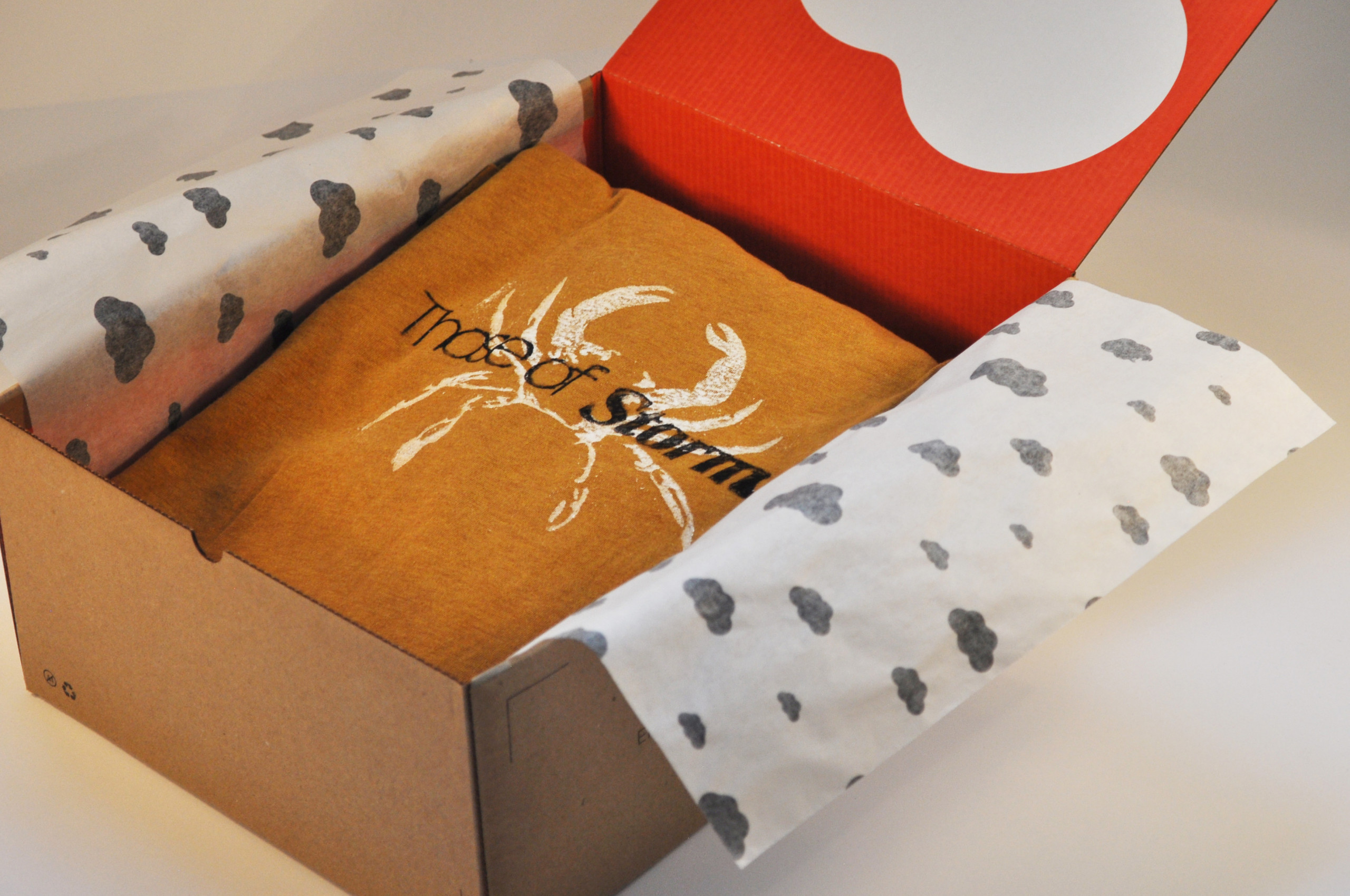
Those of Storm
Graphic Design
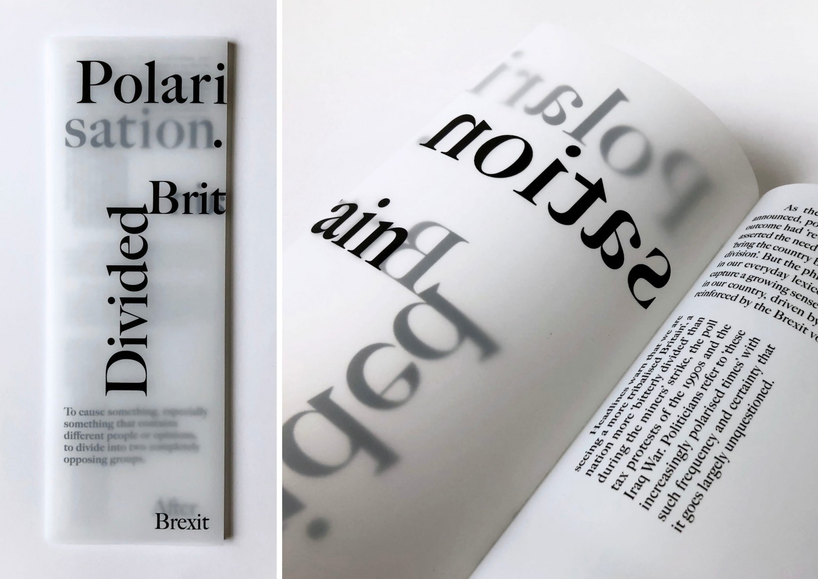
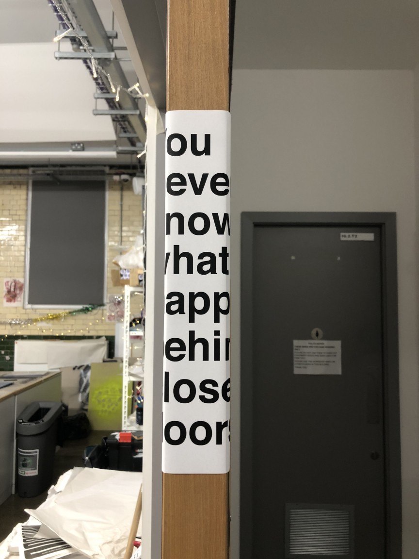
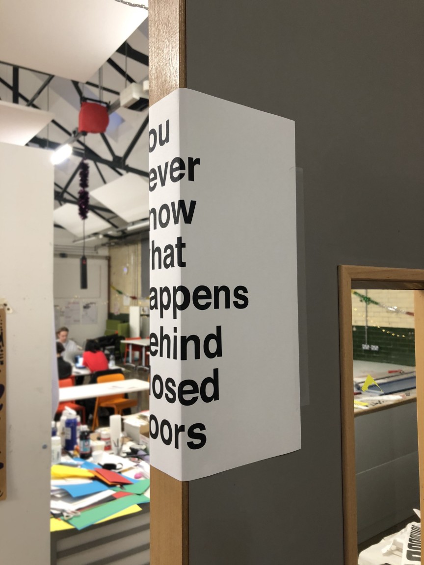
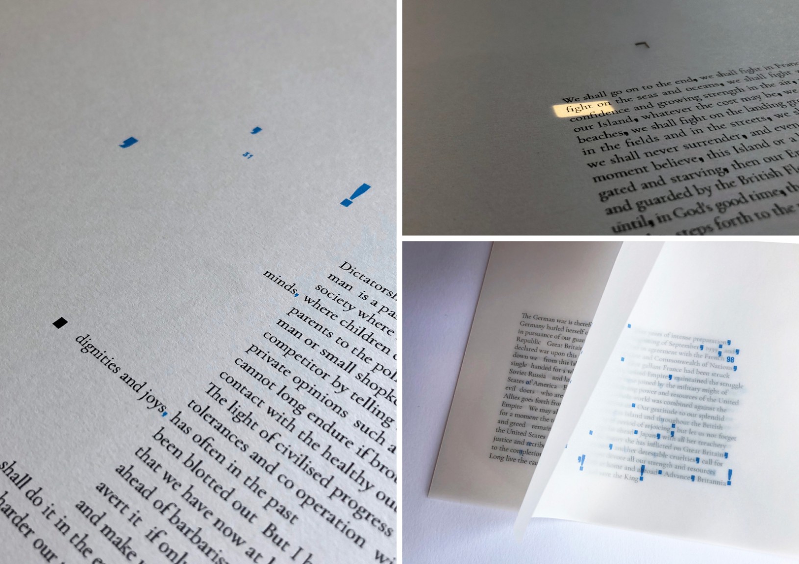
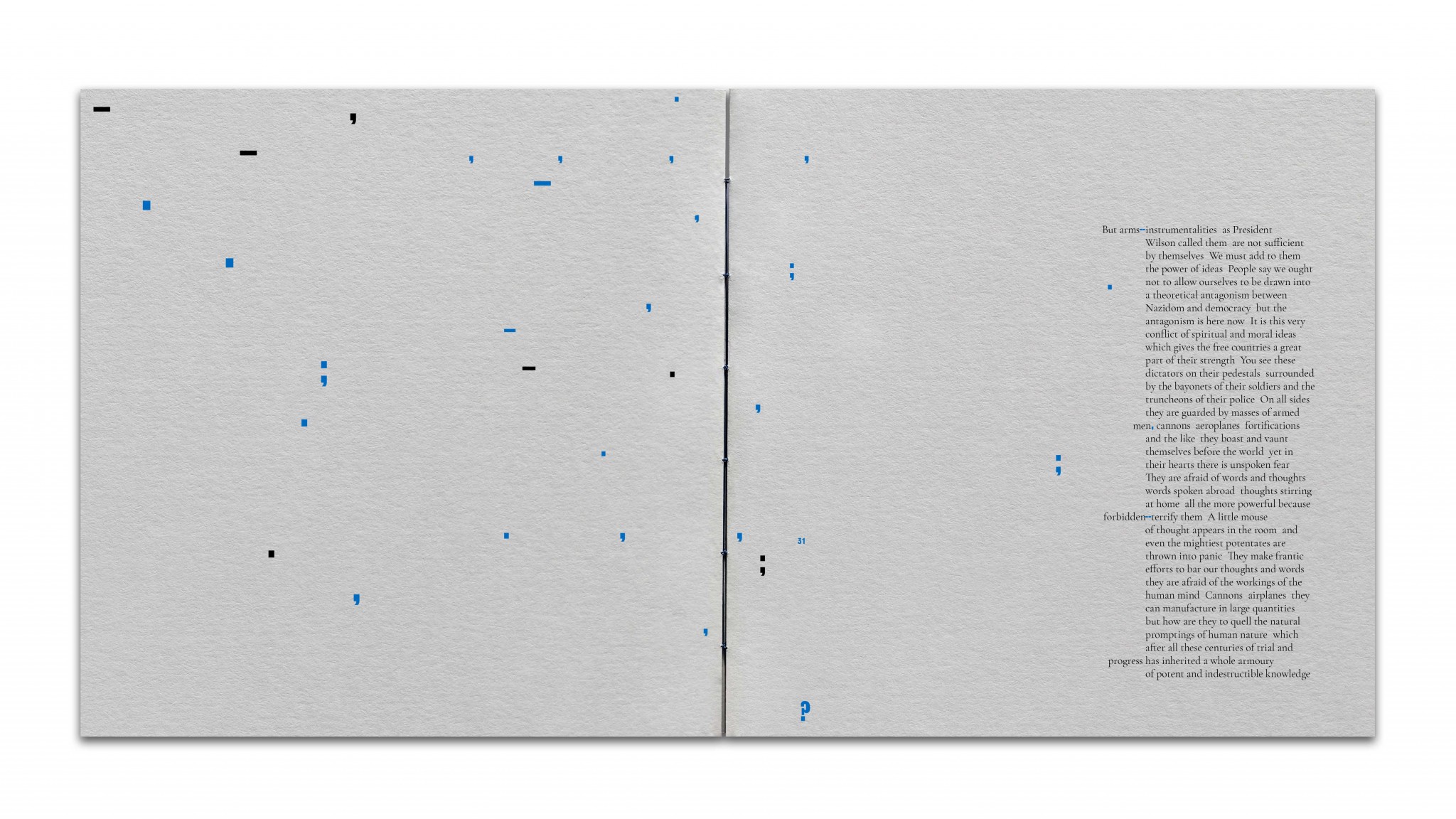
“I was interested in the idea of a polarised society as a political definition and the opposite of this being the scientific definition – the polarisation of light. This created lots of visual ideas of opposites, size, division, folds, repairing and more”.
For Twelves, delving into research (and sometimes getting lost in it) is the most exciting part of a project.
“Finding that one snippet of information or that one thing that makes your project fall together is the greatest feeling – it’s normally the thing that makes your idea stand out from the rest!”
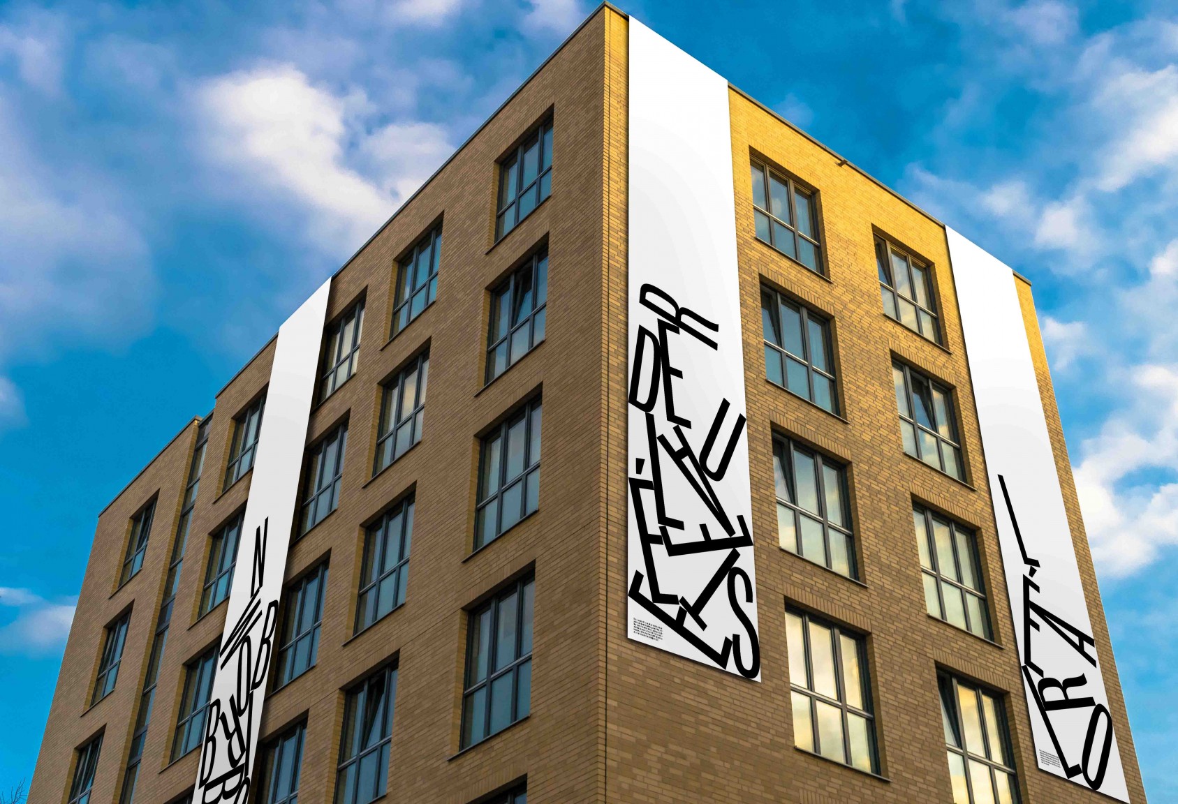
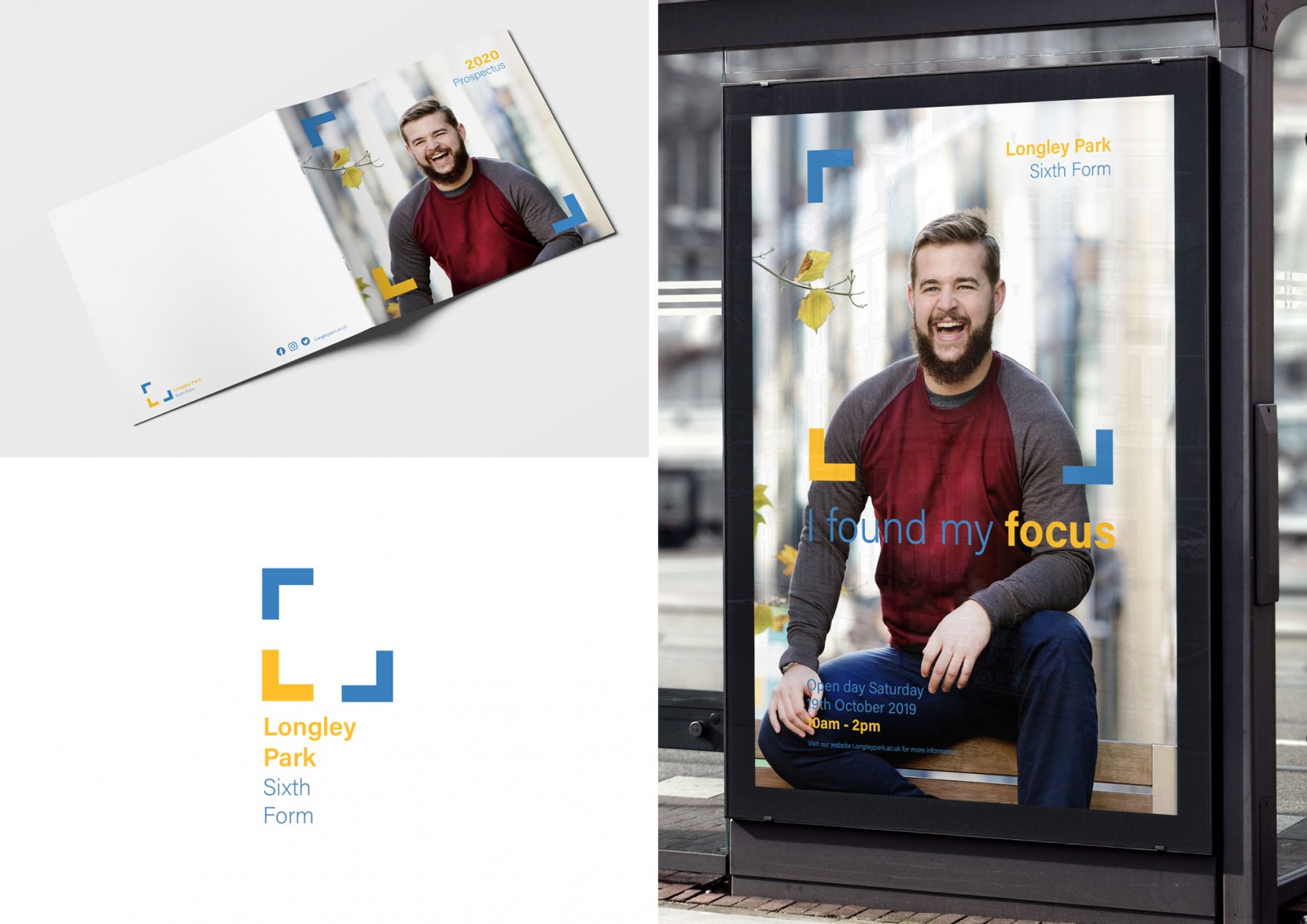
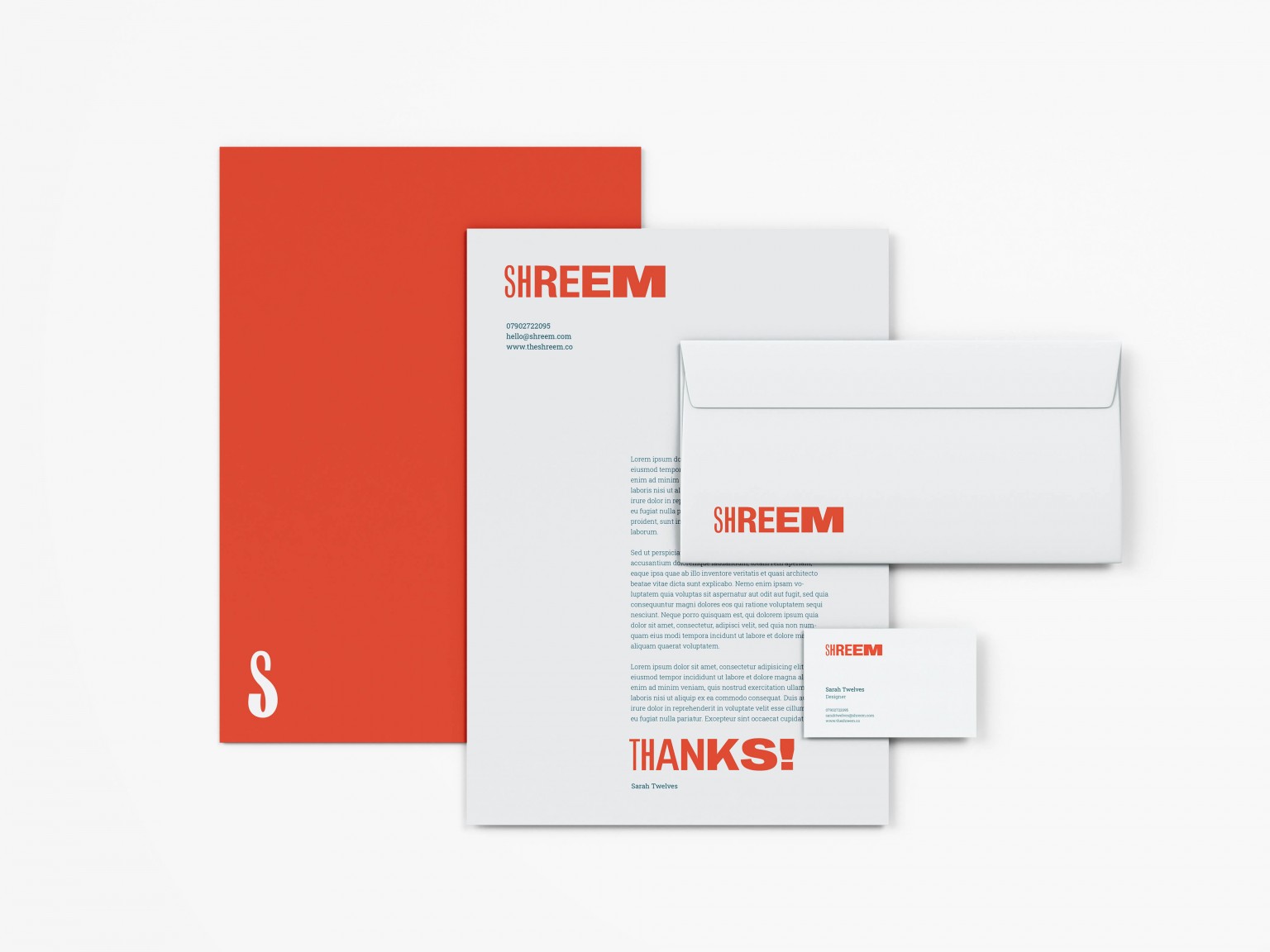
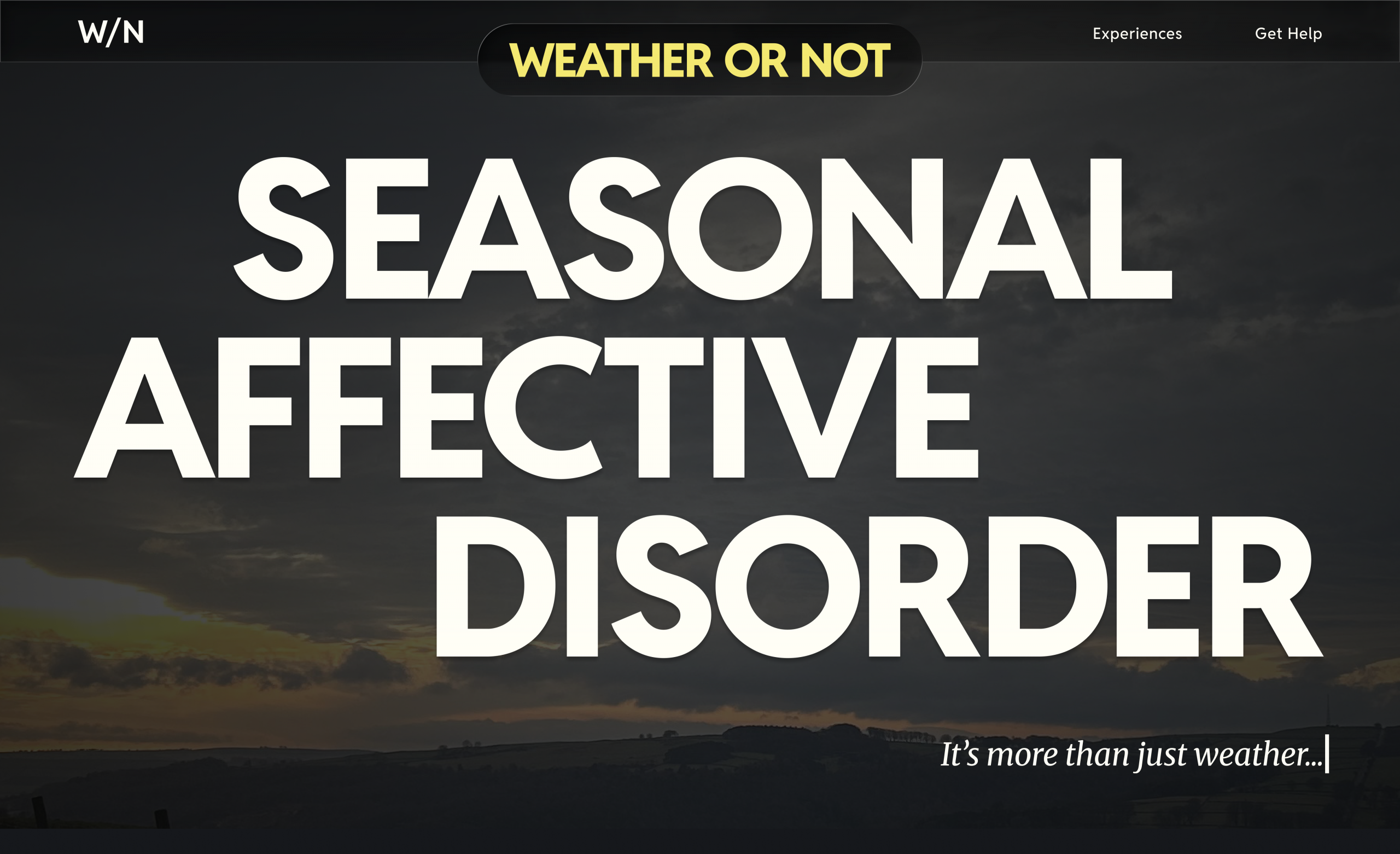
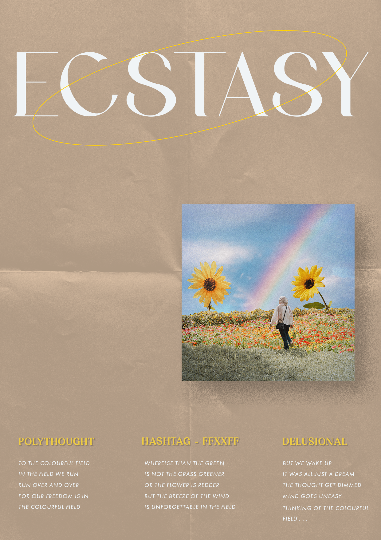
She has a love for typography and it’s endless possibilities and her projects naturally have typographic outcomes.