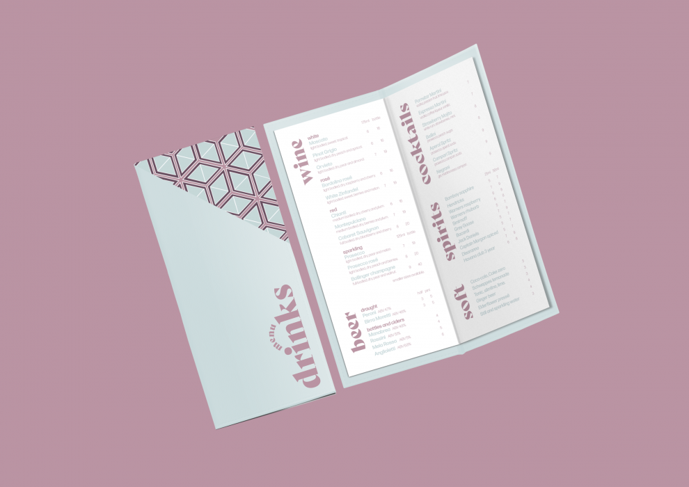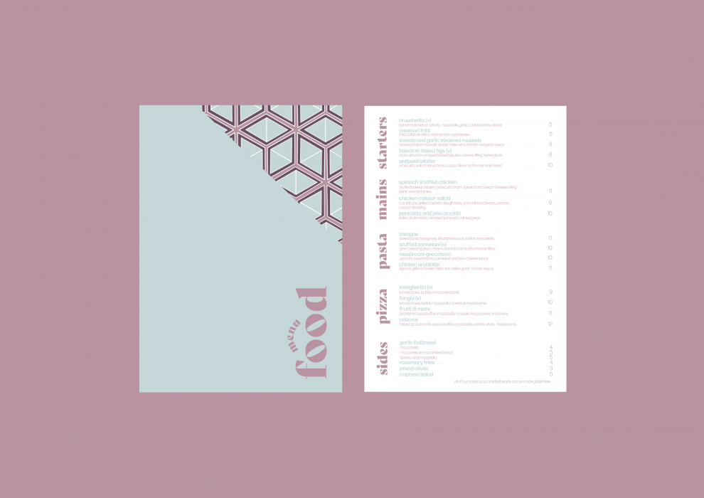
Becky Fishwick produced a rebranding project for “Rossi’s”, a traditional, family-run Italian restaurant, in the heart of Sheffield. The restaurant is located in an old bank, with an interior that takes inspiration from the architecture and design of the Vatican, embellished with marble structures and paintings of the renaissance period. The objective behind this design was to highlight the long establishment of the business, reminiscent of the restaurant’s family rooted recipes and homemade food.
Through extensive research, Fishwick identified that Rossi’s was not appealing to its customers as successfully as it could be, due to an overriding perception that the design felt outdated and distasteful. Becky’s capability to connect with the client at a personal level ensured their needs were still met, despite the criticism they faced.
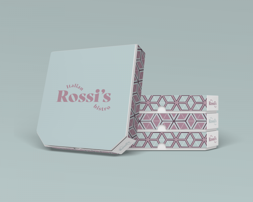
Fishwick’s updated design resembles the current Vatican interior, however, has been muted down to fit a contemporary environment. The heavy use of light blue is redolent of the renaissance period, with the serif typeface mirroring the text used on the walls and readings within the Vatican. A geometric pattern has also been introduced as it corresponds to patterns used within the Vatican but has a sense of playful familiarity, as they also appear to have the same shape as pizza slices.
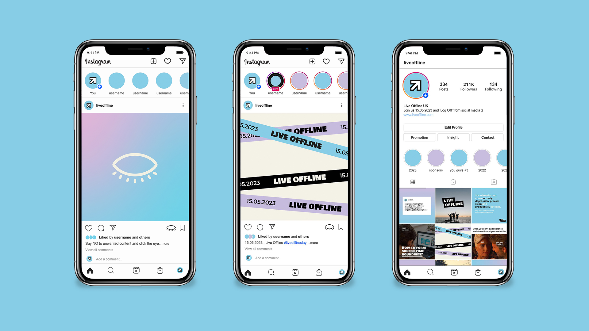
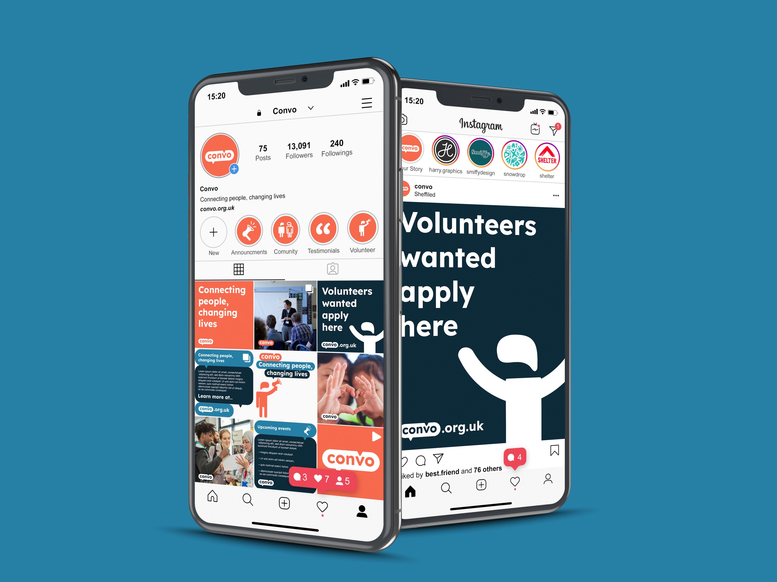
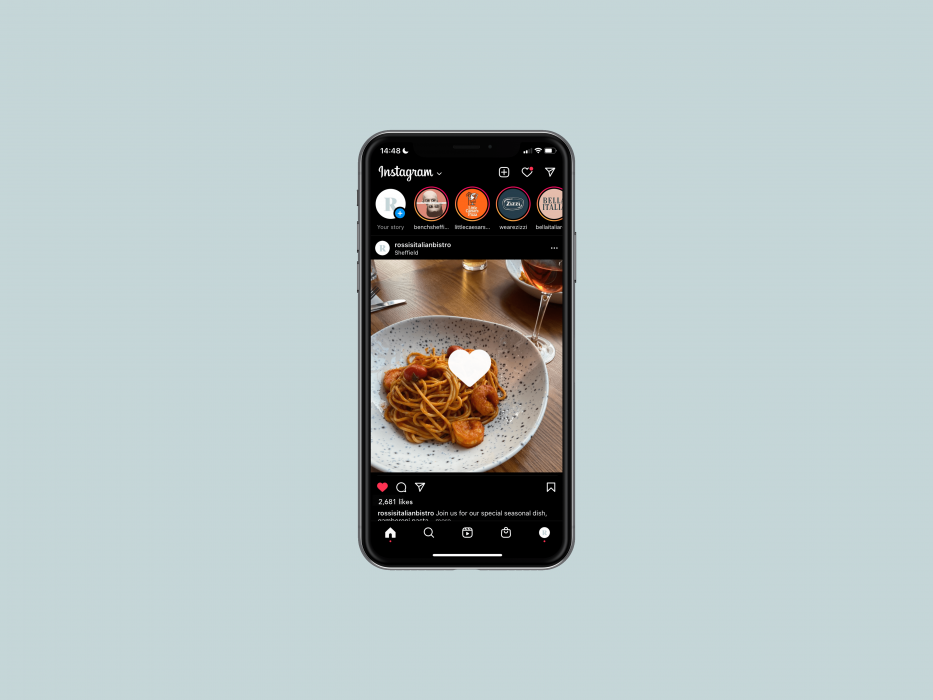
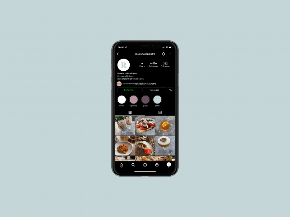
As Rossi’s previously failed to showcase their award-winning food and connect with their customers outside of the restaurant, social media design has been another addition to this project. Fishwick’s love for photography enabled her to promote the business positively and has allowed the restaurant to now communicate to a younger demographic too.

