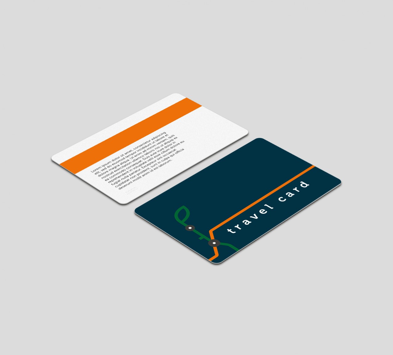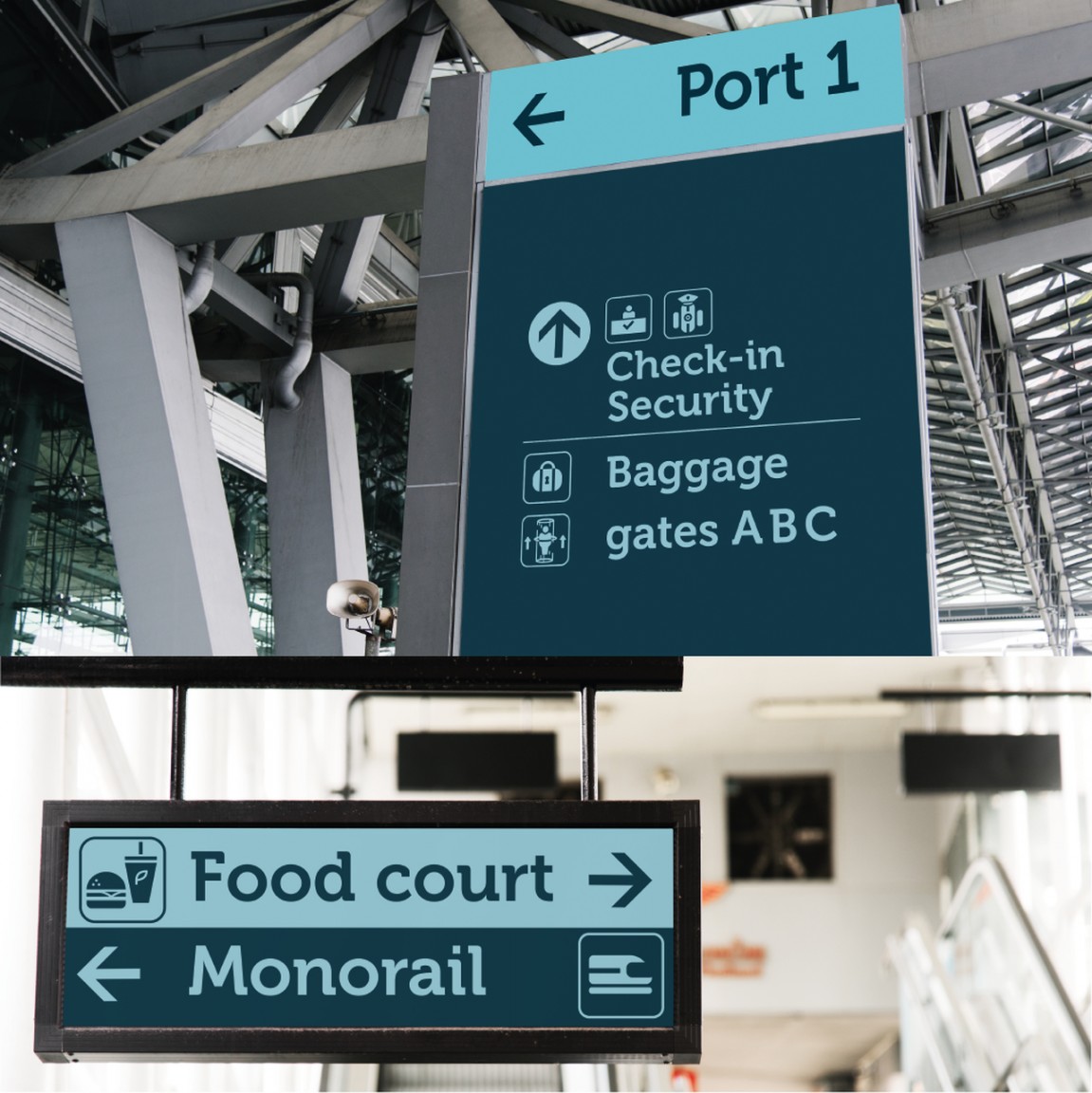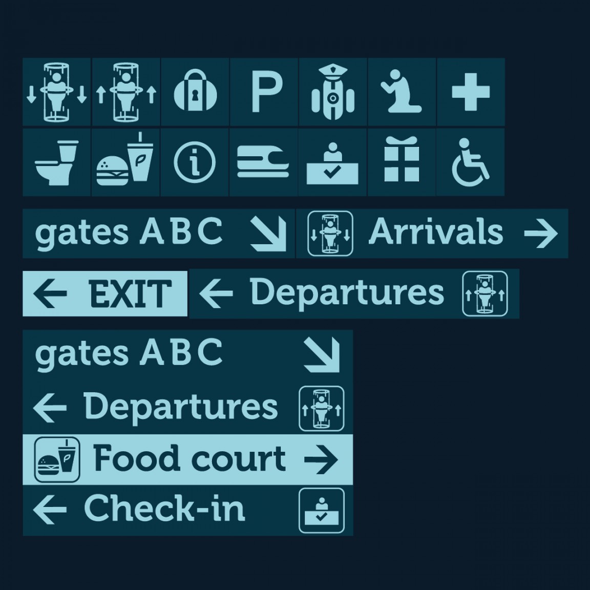
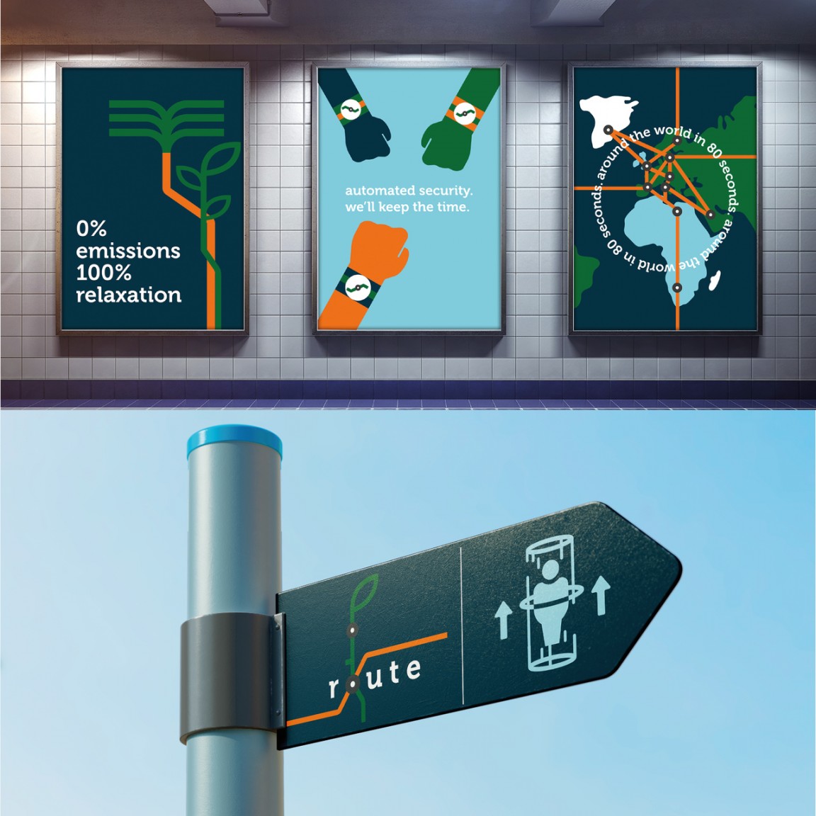
Route imagines how a teleportation brand may look. Maddie Barker’s futurologic brand embraces the teleportation as an environmentally efficient and clean alternative to aeroplanes. The teleportation devices are situated at airport-like ‘stations’.
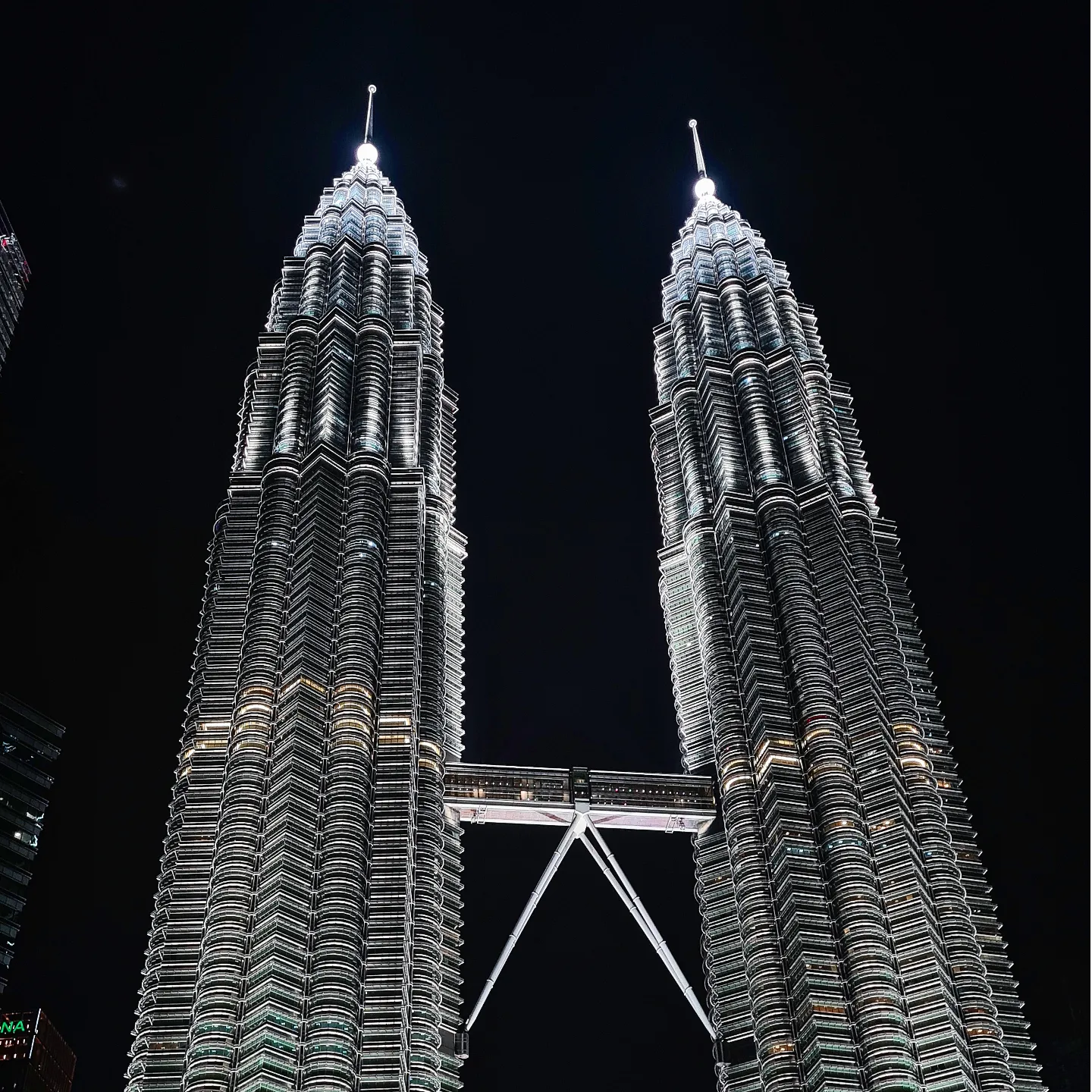
The basis of the identity was inspired by simple, line-based subway maps, which offers a flexible, yet fun, shorthand transport language – the promotion animation, for example, shows the line of the logo being used to create different landmarks around the world. The brand name, Route, is almost homonymous – symbolising a direction of travel yet recalling tree roots, represented by the leaf in the logo, an echo of the eco-conscious nature of the brand. The font used, Museo, is a serif font yet has a soft and organic look which combines with the simple line-based logo to uphold the friendly and conscious messages of the brand.
The branding consists of a logo, a wayfinding signage system for the stations, and static and animation-based advertisements.
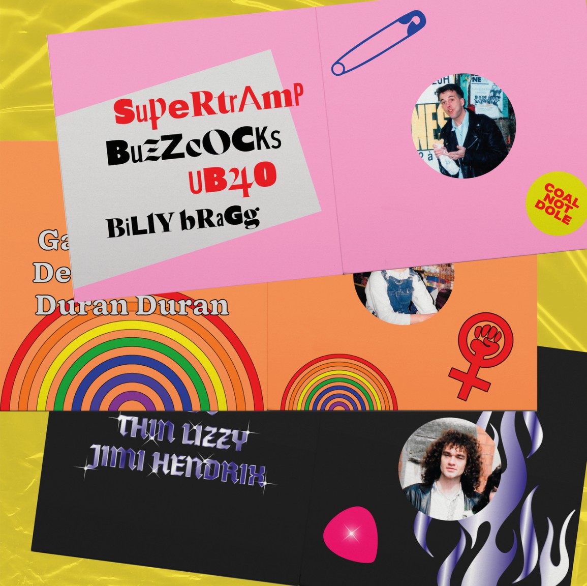
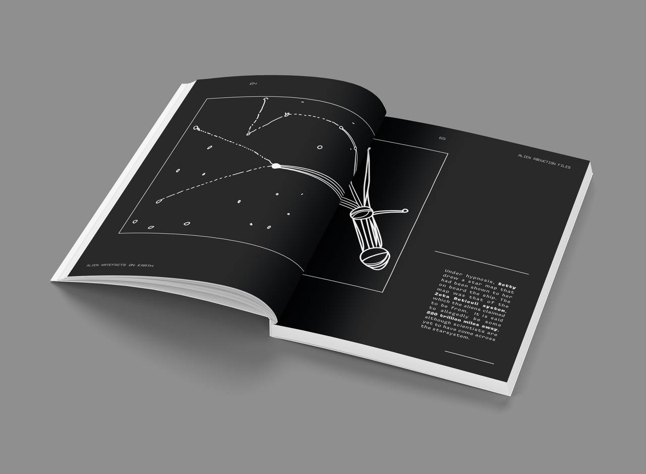
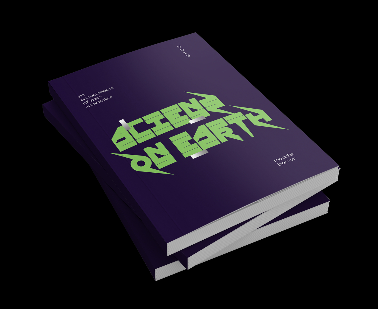
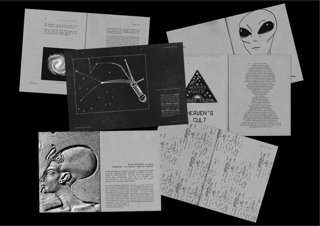
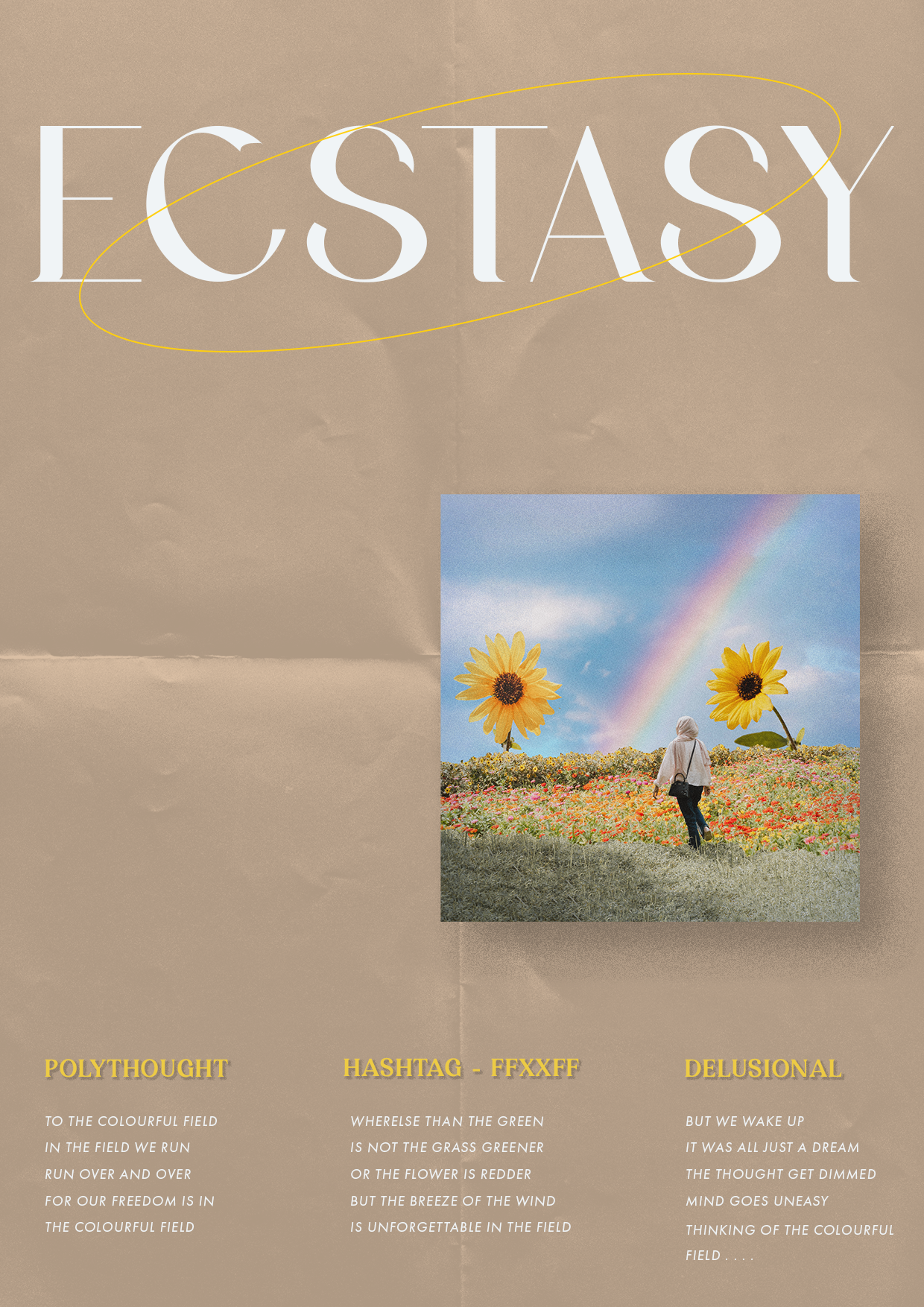
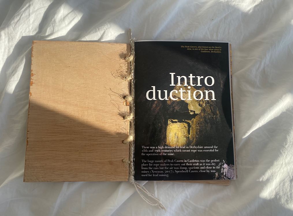
For Barker, design isn’t just clever thinking and ideas, but a catalyst for expression. She loves loud, proud, and colourful design that defies trends and pushes her out of my comfort zone. Her primary interest is in brand design and identity, but she recently have also developed an interest in publication design, which she has explored through her project Aliens on Earth.
