“How do we eliminate the gap between design and information?”
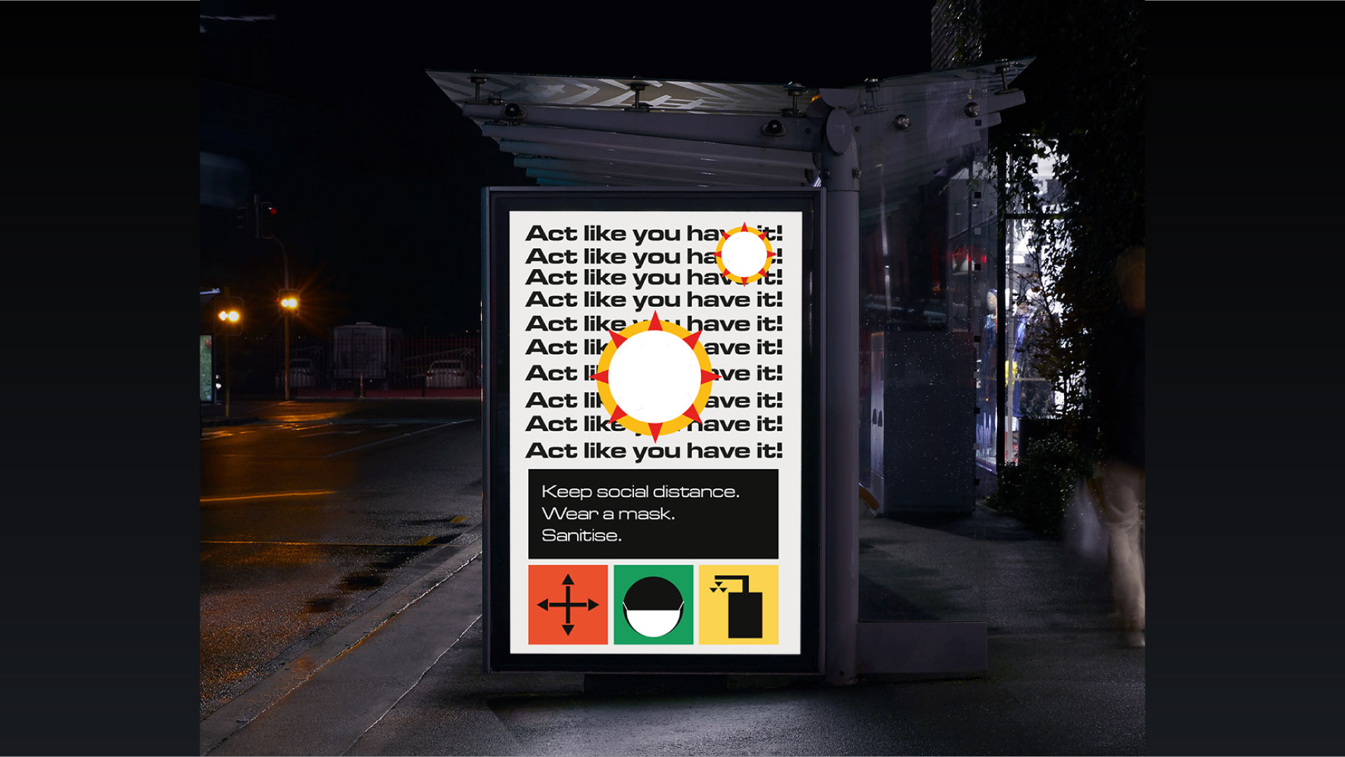
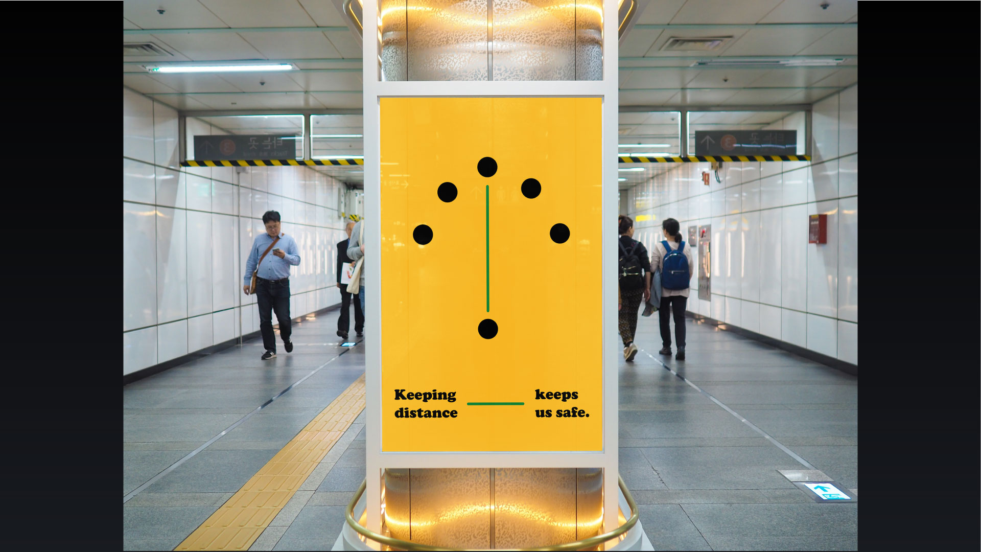
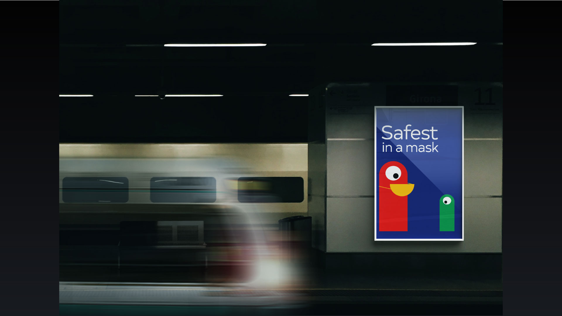
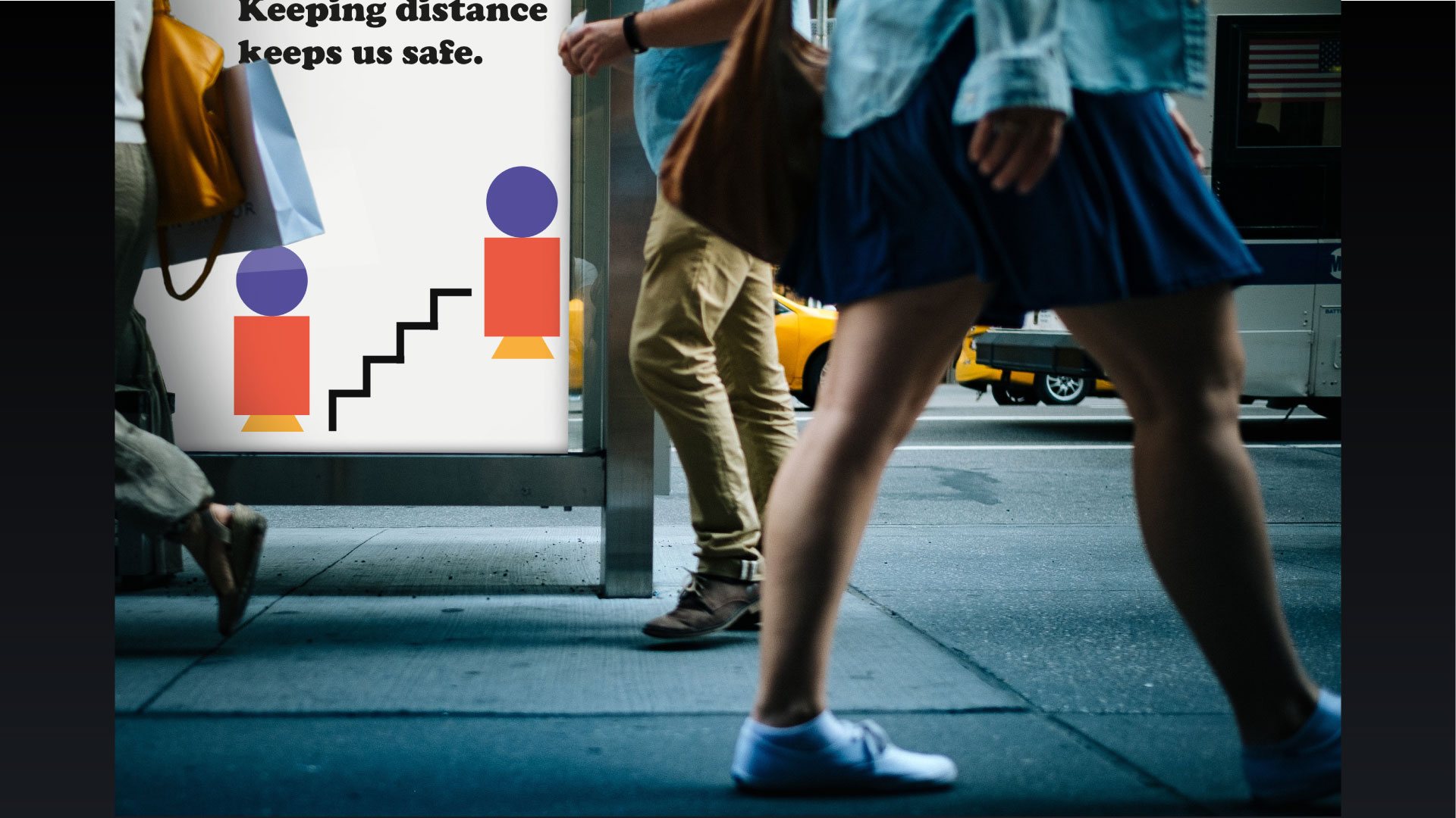
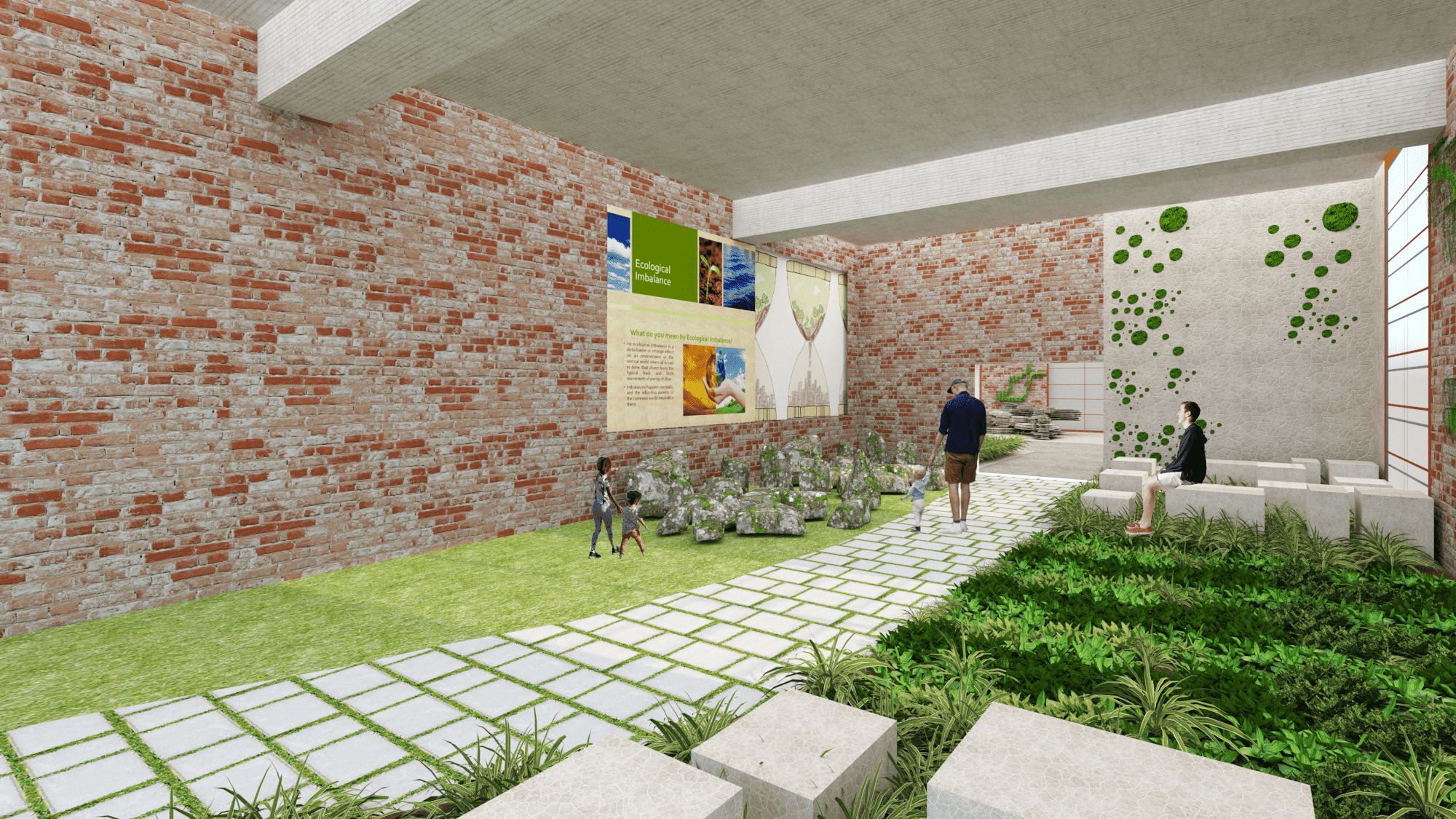
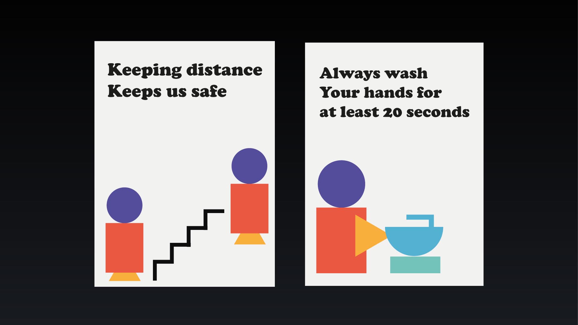
Diptya Ghosh has developed a range of wayfinding and signage for use in a pandemic. In emergency situations, the use of visual elements in communication design is often overlooked. Materials which communicate rules and regulations, the use of colour, space and design are neglected due to the simple fact that it is too much of an effort to incorporate them. This pattern of keeping design secondary to everything in a communication media is an approach taken by smaller businesses and households. Ghosh aims to eliminate the sense of effort and prioritize visual cues for a socially active environment.
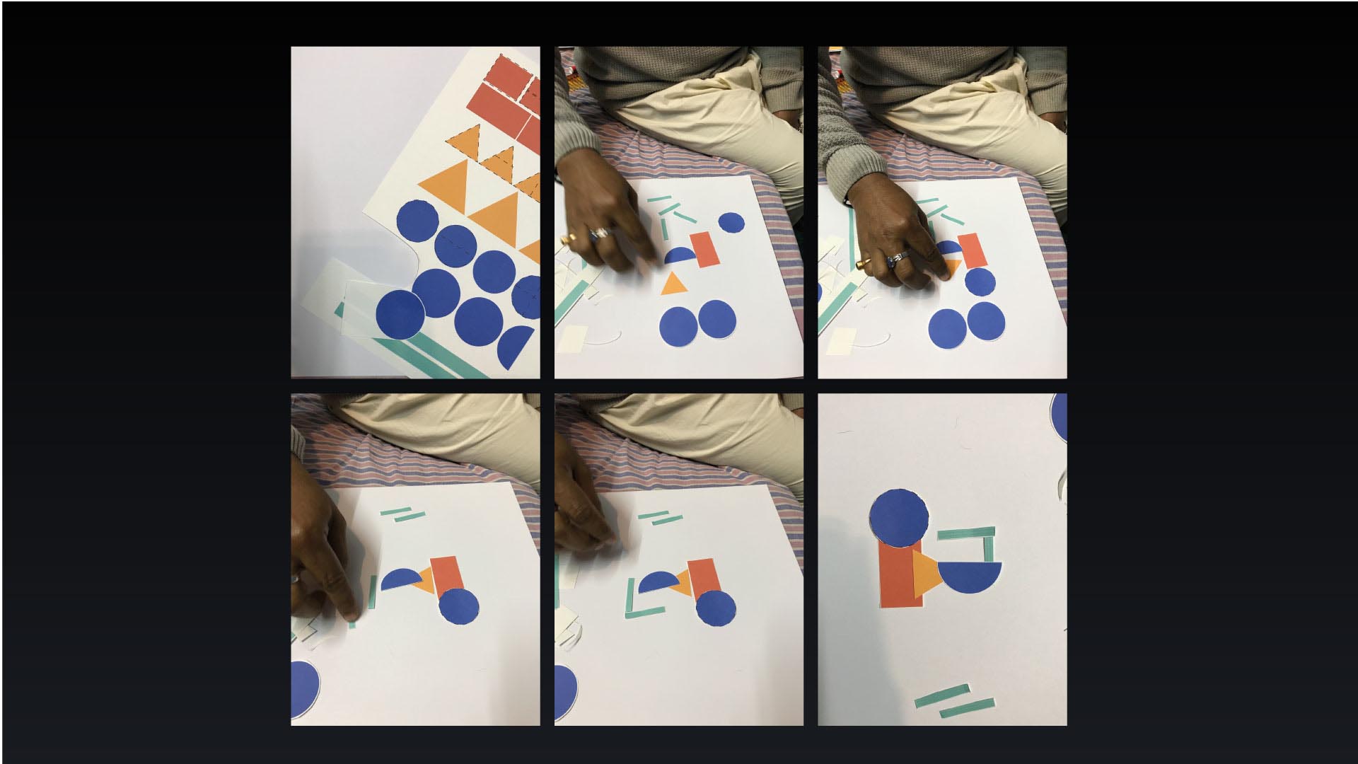
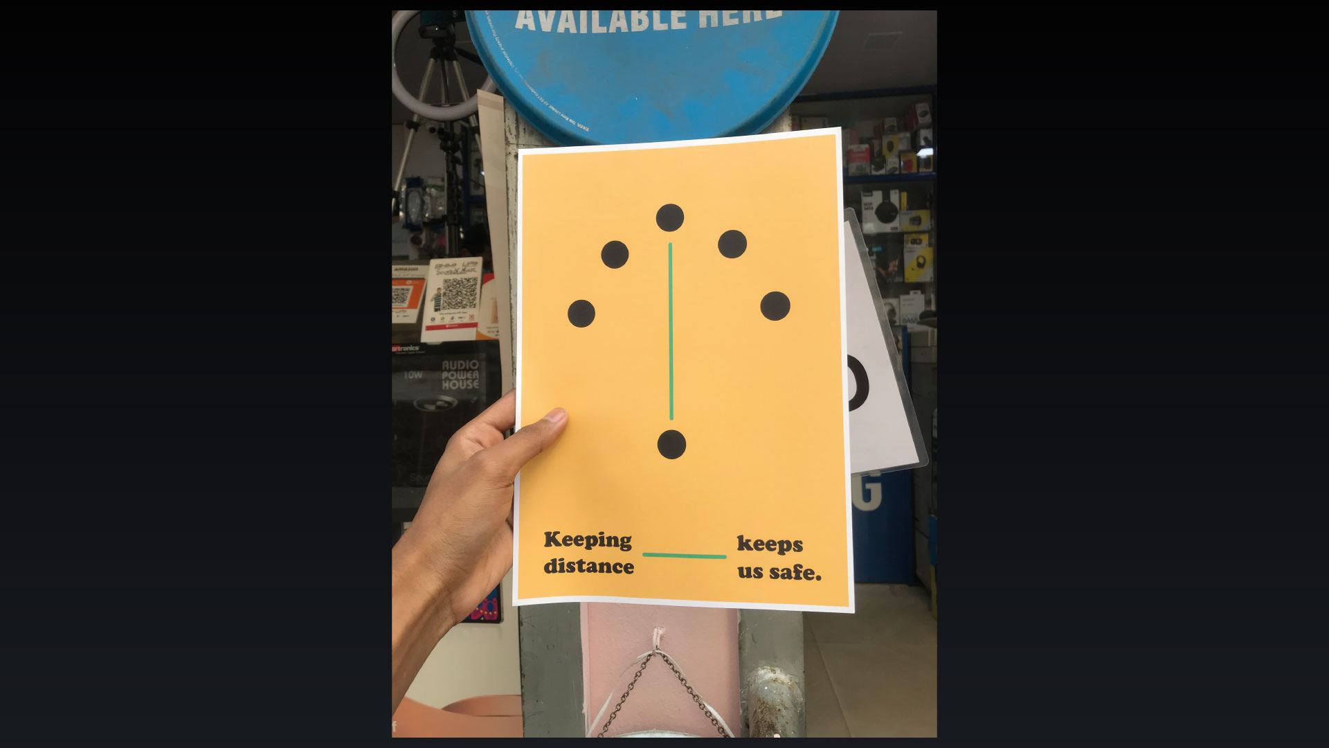
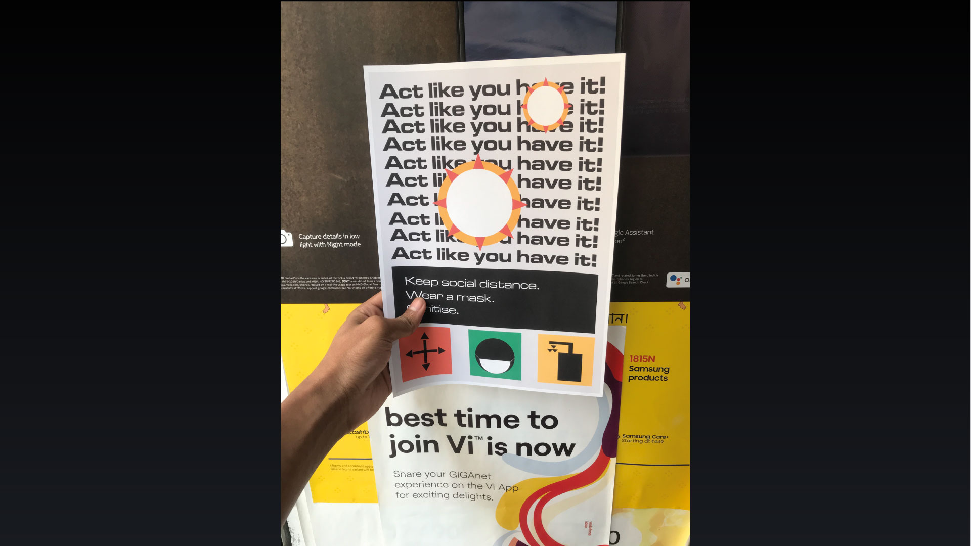
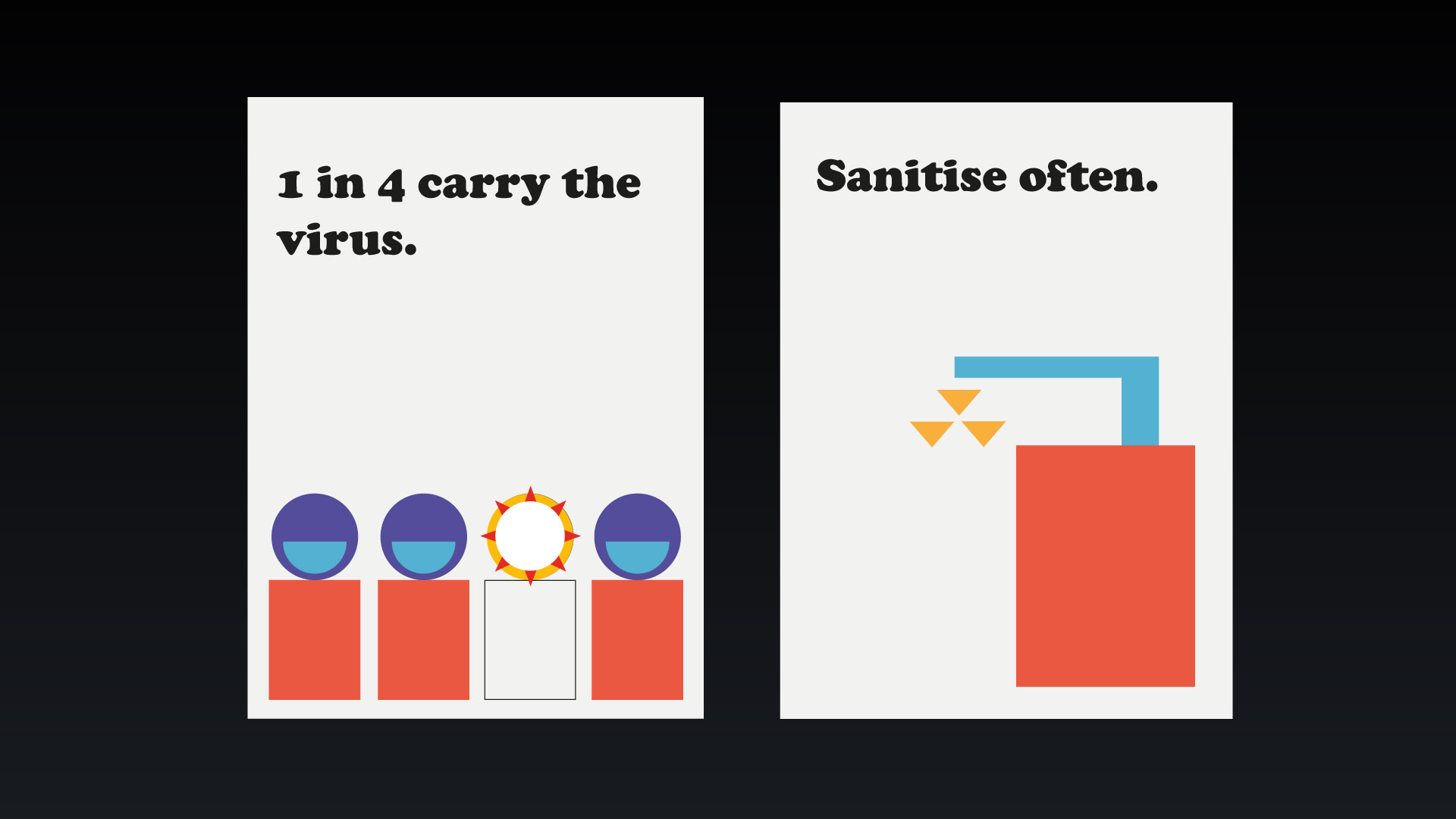
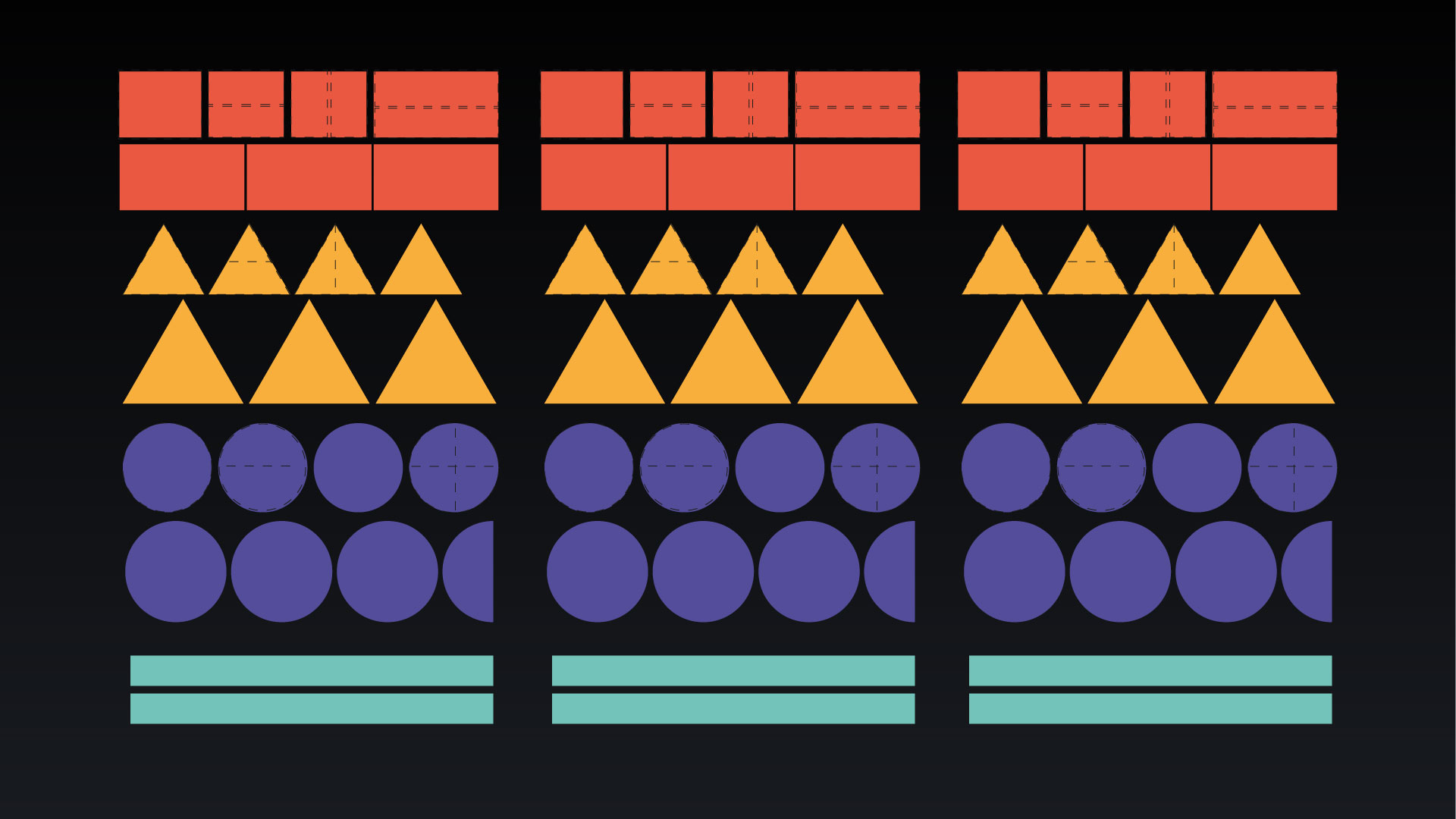
Ghosh proposes a media kit giving people the ability to communicate basic pandemic regulations with simple shapes and colours, reducing the need for professional design knowledge whilst retaining the impact and assertiveness of the recommended protocols. This also encourages a way of education by the method of involvement and interaction. The kit is inspired by the Bauhaus principles and follows the Gestalt theory – both of which focuses on the use of basic shapes and colours and their how they impact human behaviour around.
The kit comes with a sheet of shapes – different size and colours with guided cut marks. Instead of printing a low quality, temporary and ineffective posters, this kit is made in such a way that the end user can organize the elements to form an apt message regarding the COVID pandemic. The versatility allows repeated use – shapes can be removed and other messages created.
Ghosh notes: “as a design researcher from India, I have noticed how the graphic language varies from place to place, even within a particular city or region. I hope with the system I have researched and developed it should help unify the few common things we are all following around the world”.
